Hi all,
I’m trying to visualize the Peak Loads and cooling demand for HVAC Sizing by zone but I’m finding some issues:
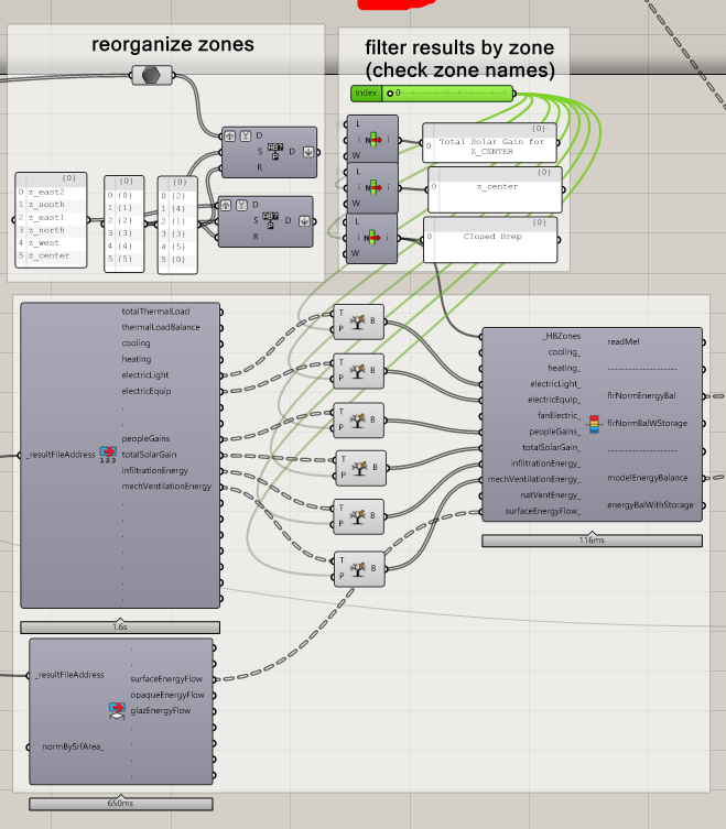
The image below is how I’m filtering the results. I wish there was a better way as the zones results is a different order from the model zone order (that why I’m replacing paths), and this is very messy :
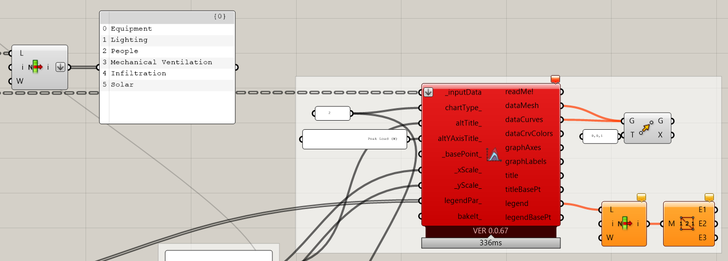
The Peak Loads graph (ladybug line chart) does not work for centre zones with no solar gains (solar gains is always “0”):
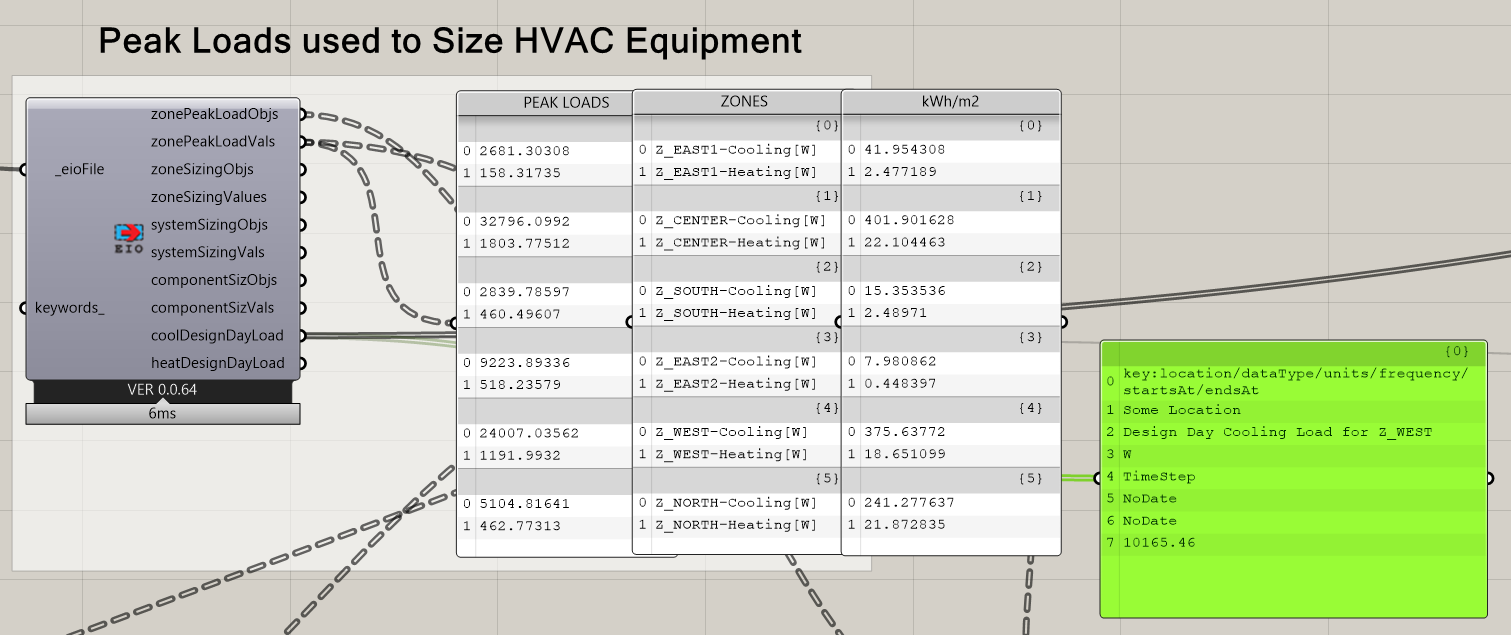
And the Cooling Demand graph does not work if you split the building into zones:
Visualize_Peak_Loads_for_HVAC_Sizing_BYZONE_DISCOURSE.gh (1.0 MB)