Hello,
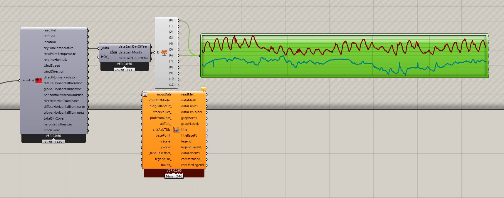
I wanted to make a simple line graph that compares dry bulb temperatures of two months. Unfortunately i didn’t come up with a way to do that with LB visualisation components. What i want to do is get DBTemp (hourly) for (let’s say) January and July in location X and and compare these two on one line graph. It can be easily done with grasshoppers native “quick graph” component (picture below). The problem is that I cannot bake the curves and i dont get these super-goodlooking legends, axes and labels ;). Of course it’s not that hard to create such graph on my own, but I’m sure I’m missing something here and there is a way to do that with LB. If so, could you point me in the right direction?
Thanks, have a nice weekend.