Legacy Psychrometric chart - Rhino 7

Hi,
I wanted to report that the psychrometric chart is not working well in Rhino 7.
Tried some things, but even with the minimal required inputs i get:

  1. Comfort polygon has fallen completely off of the psych chart.

I know that this can be irrelevant because there will be a chart soon for LBT, but for those that wonder what is going on, stick with Rhino 6.
-A.

Thanks for reporting, @AbrahamYezioro . I was able to recreate the issue on my end and I am not surprised since we had a similar situation with the Psych Chart between Rhino 5 and Rhino 6. It’s just that I coded the Legacy Psych Chart so poorly in that I rely on the rhino intersection functions returning objects in a certain order, which (pretty understandably) changes between revisions of Rhino Compute.

Part of me really wants to just let the Legacy plugin be only for Rhino 5 and 6 only but I’ll probably end up putting in a fix at some point if enough people ask for it.

In the meantime, I just pushed a Psychrometric Chart component to the LBT plugin yesterday but it does not include comfort polygons. I have decided that it’s best to keep the drawing of the psychrometric chart as a separate component from the one that draws the comfort polygons. This is both from my perspective as a developer (eg. separation of concerns) and (hopefully you’ll agree) from the user perspective as we’ll be able to add many more inputs for customization when they are split between two components. This should also open up the possibility of plotting polygons generated from other comfort models like UTCI at some point, which we actually have most of the code infrastructure for right now.

In any case, the “LB PMV Comfort Polygon” component should be coming soon if you wat to start getting your feet wet with the “LB Psychrometric Chart”. And it might be needless to say but I’m coding everything much better now so that the new Psych Chart won’t break when we eventually get to Rhino 8.

2 Likes

Hi @chris,
Thanks for the update.
I agree with your view of “divide and conquer”. If it makes things easier for developing (and debugging) i can agree more.
For me the comfort and strategies polygons are a must (BTW, just yesterday had a class when i showed them the chart and the strategies. They need to do some analysis of it). I’ll have this class again next semester, so hopefully this will be functional before that.

Just tested the brand new LBT Psychrometric chart. Spotless. I really love how things are working, fast, clean and clear. This is a very good job (I said that before but i can’t say enough).
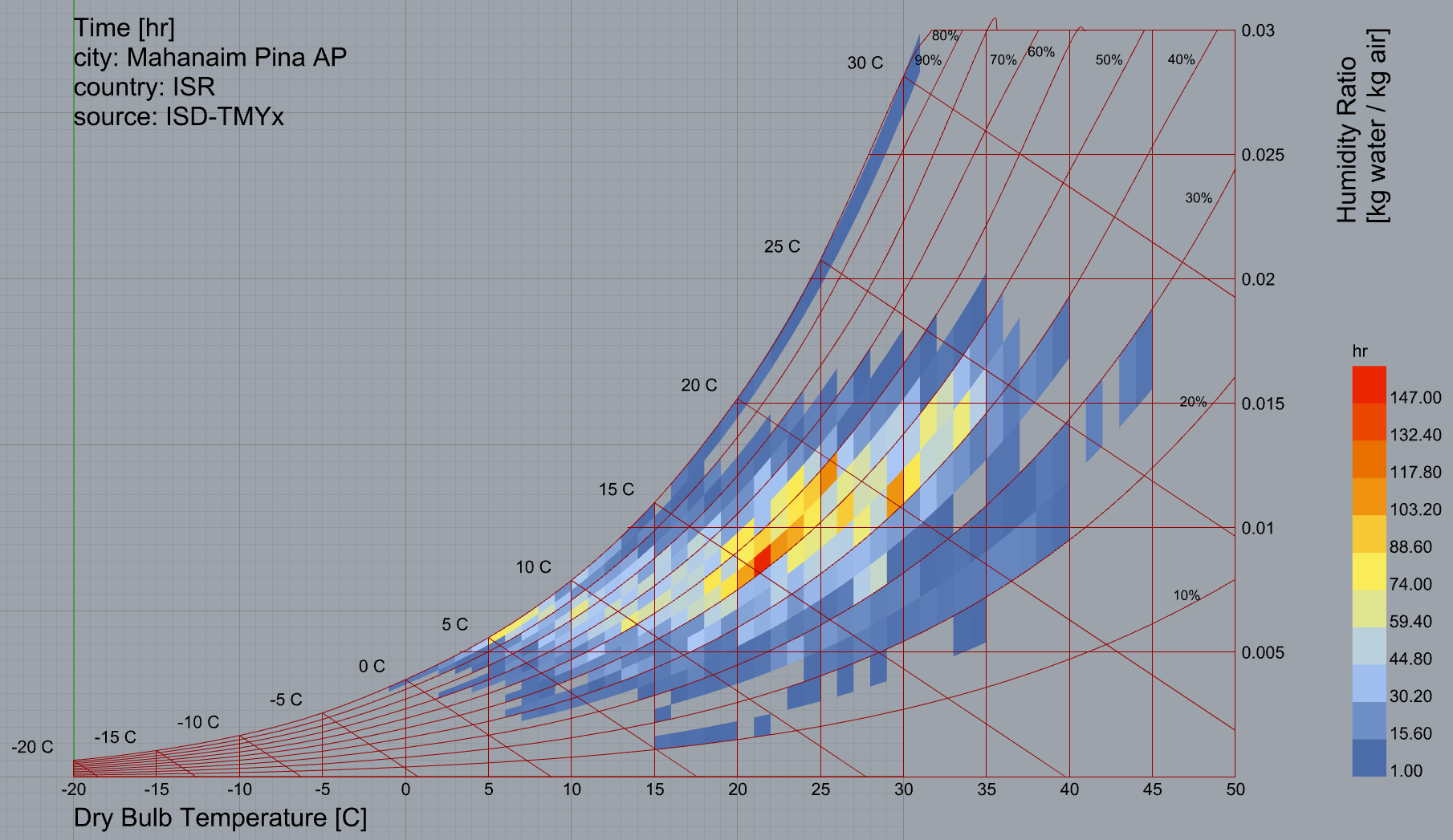
Just for the fun see the charts below. The epws are from climate.onebuilding.org. More than funny maybe some concerns can arise from what you see. The top image shows some strange behaviour with the chart lines (RH) and the bottom one shows that the data has some issues with the strip at the 100% RH line.

Just bring the other components on. I’m ready to test … :slight_smile:
Thanks,
-A.

Thanks @AbrahamYezioro. That’s why you’re the bug-finding master!

It looks like I hadn’t tested it at enough locations of high elevation / low pressure. I just pushed a fix that will get the lines of the chart to display correctly at these lower pressures:

Things are looking good now:

You should be able to get the fix on your end in a couple of hours.
FYI, it looks like there is, in all likelihood, an error in the EPW data for the second EPW file. Whatever, the case, it’s not a problem on the Ladybug Tools end and the EPW data has these very odd conditions of high humidity and temperature for a day in April:

It might be worth emailing the onebuilidng people about this.

In the meantime, I’ll be working towards the comfort polygons.

Hi @chris,
Thanks!!
Now it is fine (of course).
About the data in the EPW, i know this is not a LBT issue. Just wanted to show you this “funny” thing. I already contacted the onebuilding regarding another station. They (Linda and Dru) were very helpful. I’ll send them this new issue. Maybe i need to check all stations in Israel before that.

-A.

Indeed they are! I know that they care a lot about the OneBuilding weather database. I hope they’re able to get to the bottom of it.

@AbrahamYezioro ,

You will be happy to know that the psychrometric chart polygons are all ready for you to test in the development version of the plugin. And, once you run the Versioner, here is a sample for you that you will be able to run:
https://github.com/ladybug-tools/ladybug-grasshopper/blob/master/samples/psychrometric_chart.gh

There are a few key advantages that the new polygons have over legacy:

  1. The performance is now good enough that you can hook up sliders and move the comfort polygon around in rea time (each run of the component is usually under half a second)
  2. You now get warnings for specific polygons when they fail to plot. So there’s no more mysterious “comfort polygon has fall off the chart” error and one polygon not fitting on the chart won’t stop the others from plotting.
  3. The merging of comfort polygons is better.
  4. The implementation is much more robust and the exact same code works in Rhino 6 and Rhino 7.
  5. Everything plays nicely with the new features, like the new ability to set the min and max temperature of the chart for different climates.

The only limitation is that I don’t currently have polygons for desiccant dehumidification, humidification only and dehumidification only but these weren’t really implemented correctly in legacy anyway. I’ll try to do a correct implementation of desiccant dehumidification soon but, in the meantime, all other polygons are fully supported.

2 Likes

Hi @chris,
Thank you very much!!! Very happy!!
I was trying to "break"it but no success. It works super fast and super nice.
I was comparing the new with the old. Besides some small % differences in the calculations they are pretty much the same. But anyway i’ll keep checking it.

There is one thing that i miss and it is the possibility of color the comfort/no comfort points (chartHourPoints, hourPointColors and hourPointLegend outputs in Legacy). It was a nice to have, but no critical. Besides that i am exactly where i am with the Legacy workflow, but performing much better, of course.
Overall i can say that i don’t know what you did in LBT but is like you put all Legacy on turbo … :slight_smile:
Great thing @chris. Thanks again,
-A

Thanks for testing it so quickly and for the encouraging review, @AbrahamYezioro .

Glad to hear it! It’s not that often that I make something Abraham-proof on the first go! :slightly_smiling_face:

Yes, part of the “turbo mode” is that we use an optimized method for checking whether each point is inside of each polygon. It uses segmented polylines instead of full NURBS curves but the differences between the two should be negligible since the polylines have enough segments to decently represent any curves. Also, the new chart uses a single atmospheric pressure for all of the points to avoid the case of points for certain hours falling above the saturation line (if their pressure is lower than usual for that hour). This helps put a few more points into the strategy polygon that they should belong to. This is all just to say a little difference is to be expected but, more often than not, the LBT number is probably a little more accurate than legacy.

You can still this but it involves another component. Specifically, the “LB Create Legend” component. Here’s an example of how to do it with the total comfort data:


psychrometric_chart_colored_points.gh (40.4 KB)

… but you can just as easily do it with any other data collection that’s aligned with the points.

1 Like

This is perfect @chris. Thanks!!
Now that i think i have a wish that i hope makes sense: What about the possibility of limiting the polygons to some amount of RH (i know that you can get that in terms of absolute humidity). I miss the Bio-climatic chart (that i never get finished … shame on me) clarity on this. The view on RH is much more intuitive than the Psychrometric.

Thanks again!!
-A.

1 Like

Hey @AbrahamYezioro ,

I am open to this and I have a pretty good sense of how it should be implemented in the core libraries but it’s not the highest priority for me right now and, if I am being honest, I sense that I don’t really understand how the Olgyay/Givoni polygons work as well as others do. I know that they come from a time before the PMV model and they seem a bit more based on “bioclimatic intuition” rather than strict interpretations of thermal comfort and psychrometric models. But I can see that Andrew Marsh has figured out the mathematical description of these polygons in his free online psychrometric chart (which I highly recommend, BTW):

It seems that all of the Givoni polygons are supposed to be derived from a single “Mean Outdoor Temperature” rather than the PMV model and psychrometric laws (as the 5 strategy polygons that I have exposed here come from). So, I think the correct way to implement this in Ladybug would be to make a givonipolygon.py module in the ladybug_comfort.chart sub-package. This module would be just for plotting Givoni polygons and would be completely separate from the PMV polygons and strategies that I’ve put together here. And we would have a separate Grasshopper component for plotting Givoni polygons instead of PMV-derived polygons, which will take the “Mean Outdoor Temperature” as input instead of things like clo, met, air speed, etc.

While I wouldn’t be able to implement this myself for at least another year or so, I would definitely merge in this capability to the code base + plugin if someone else put it together. And I know Andrew Marsh mentioned he was open to collaboration with us so maybe picking his brain on the Givoni polygons is an opportunity to do so.

This is cool @chris
When Givoni proposed this chart the means to do research were much different that now. Givoni did a great job based pretty much in “live” experiments. BTW, Arens, at Berkley proposed another graph based on Givoni’s, where the comfort area for office buildings is much more strict in its definitions than the broader original one.
Andrew Marsh’s graph is very nice. I always liked the way he presents the information. Is super quick, super aesthetical, and super informative. If you can get him to help it will be a great deal. Since Autodesk bought his Ecotech he is kind of “resting”. Very nice guy.
Whenever you think this can be done it will be good. No worries and no hurries.

Thanks for sharing!!
-A.

Thanks, @AbrahamYezioro . I had a sense that the underlying research for the Givoni polygons was probably similar to that of the “live” observations used to make the adaptive comfort model (being based around mean outdoor temperature). If you have the title or link to that paper by Ed Arens, I’ll definitely take a read. I can also search for it myself but he’s quite prolific so it would be good to be sure I have the right one.

And speaking of prolific people, Andrew has been quite productive with his web apps since his Ecotect days. But you’re right that he hasn’t done desktop software in a while. I could send an email between all of us about the psych chart polygons but it might be wiser to wait until I or one of us has the time to implement something based on the collaboration. I should also take a look through his stuff and see if there’s anything else we could work together on.

Ho @chris,
This is the reference that i’ve found.
Arens, E., P. McNall, R. Gonzalez, L. Berglund, L. Zeren. 1980. “A New Bioclimatic Chart for Passive Solar Design.” Proceedings of the 5th National Passive Solar Conference, American Section of the International Solar Energy Society.
It’s been a while since i checked it, but i hope this is the right one.

A couple more that can be useful:
Givoni B., 1976. Man, Climate and Architecture. Applied Science Publishers, Ltd., London.
Murray M. and Givoni B., 1979. Architectural Design Based on Climate in Watson D. (ed), 1979. Energy Cםnservation Through Building Design. McGraw Hill Book Company.

The last one, Murray&Givoni, shows the polygons as Andrew’s above.

And for future implementations … just take your time.
Thanks,
-A.