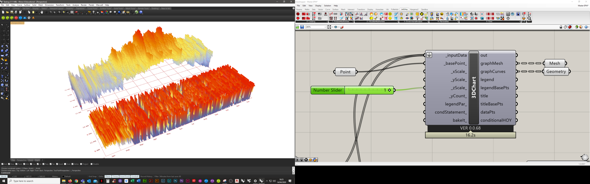
Hi,
Probablly a simple question, but I have noticed that some people’s 3d charts look quite smooth and others look more ‘bar’ like. I can only seem to get the ‘bar’ like graphic; is there a way to toggle this?
Best,
Hi,
Probablly a simple question, but I have noticed that some people’s 3d charts look quite smooth and others look more ‘bar’ like. I can only seem to get the ‘bar’ like graphic; is there a way to toggle this?
Best,
Set the Z scale to 0.
-A.
That just flattens everything.
I am trying to get the 3d projections to looks smooth… (like a mountainous region)
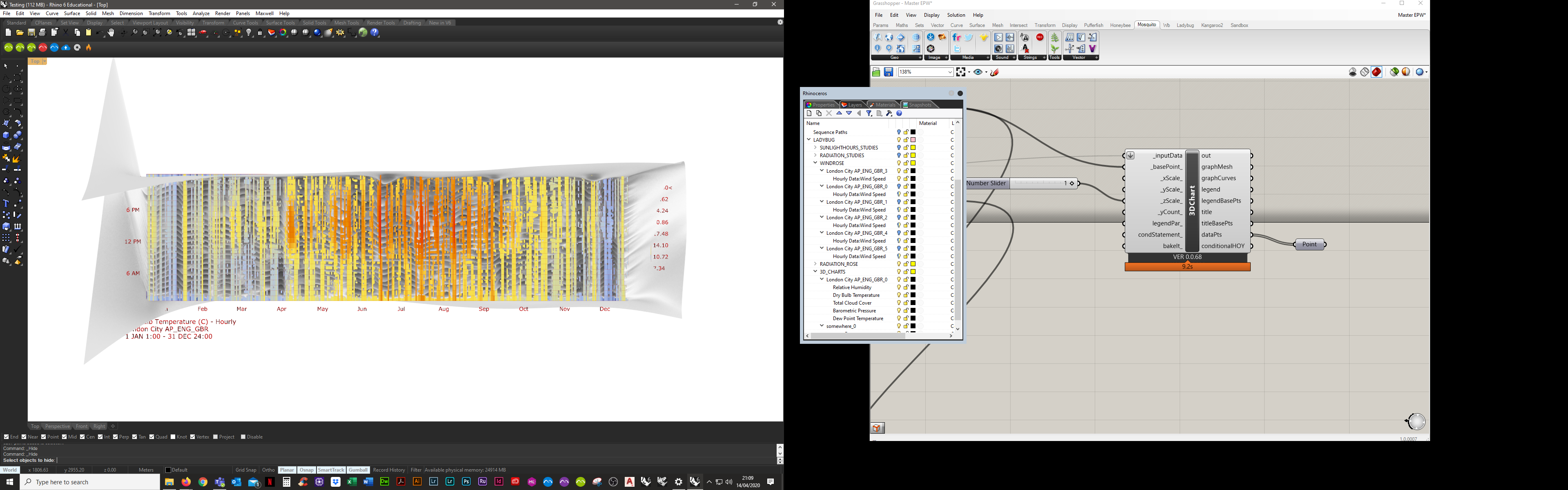
I haven’t seen a mountainous region but you can export the point from dataPts in 3D chart component then make a mesh from this point. it could be done by mesh from points, you can also merge the color.
So don’t input anything to the Z scale.
-A.
Maybe, if you assign a number like 3 to xScale you get what you want but in this video nothing special has done for “mountainous region” you mentioned.
If you want it smoother also you can contour the mesh in x and y axis and then make a network surface from them. also it will work.
youre right, I cant see anything hes doing different except perhaps the x and y you mentioned; will give that a go and the other things you mentioned… Thanks for your help.
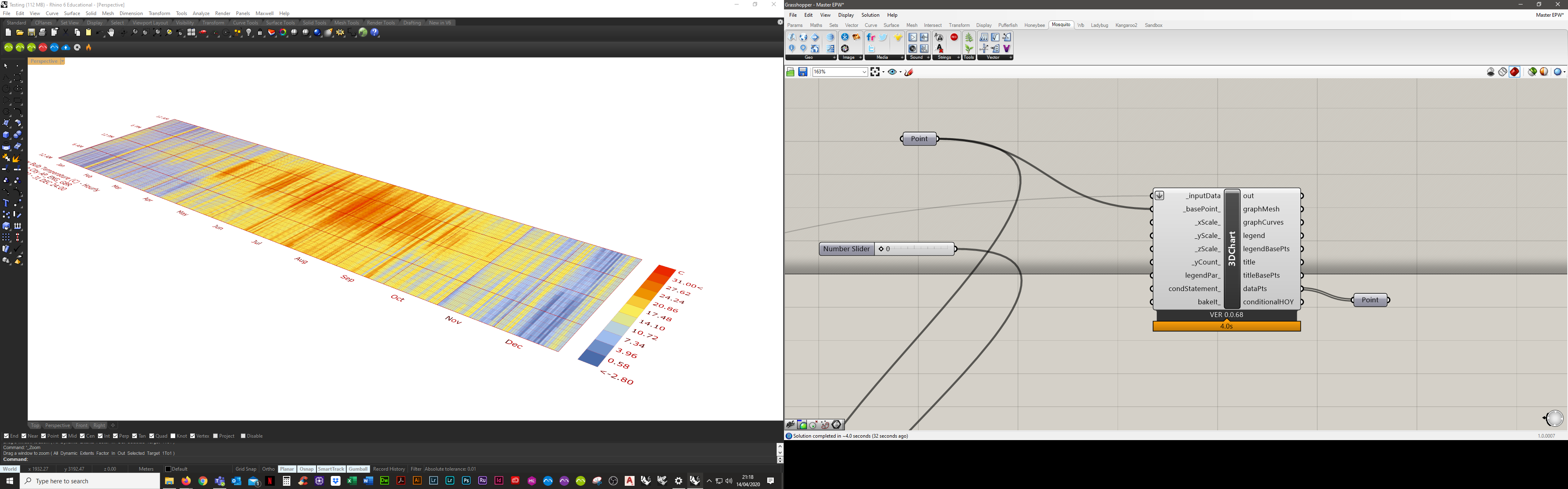
This is probably becouse the Z value is 0. When you don’t give a value in the scale it gives the Z from the _inputData.
_A.
cool… thanks… maybe the fault is with the input data.
I came across your post about 3D chart graphic styles last week, and it got me thinking about my own projects. I recently explored various designs while searching for an affordable logo design. The right style can make such a difference! I appreciate your insights and can’t wait to see how others interpret these 3D concepts in their work.