Hello,
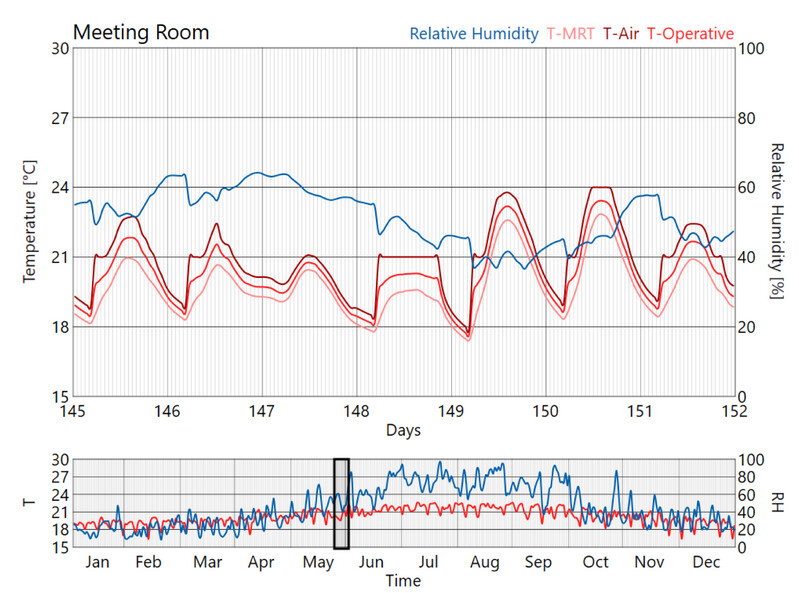
is it possible to generate a graph with hourly data for the entire year? I would like to compare different rooms and different criteria in one diagram, as seen for example here:
I know there is the component “Monthly Chart”, which averages the values for a day though.
Then there is the “Hourly-Plot”, which shows interesting patterns, but only for one room and one criteria.
Then I could also connect for example the dry bulb temperature to a “Quick Graph”, but that i cannot bake into Rhino.
Would be more than thankful to get an advice on that visualisation question!
Best regards
Tony