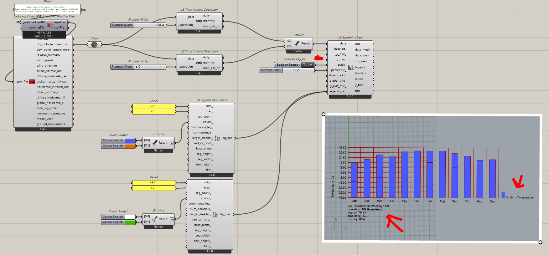
Hi there,
Need a little bit help…
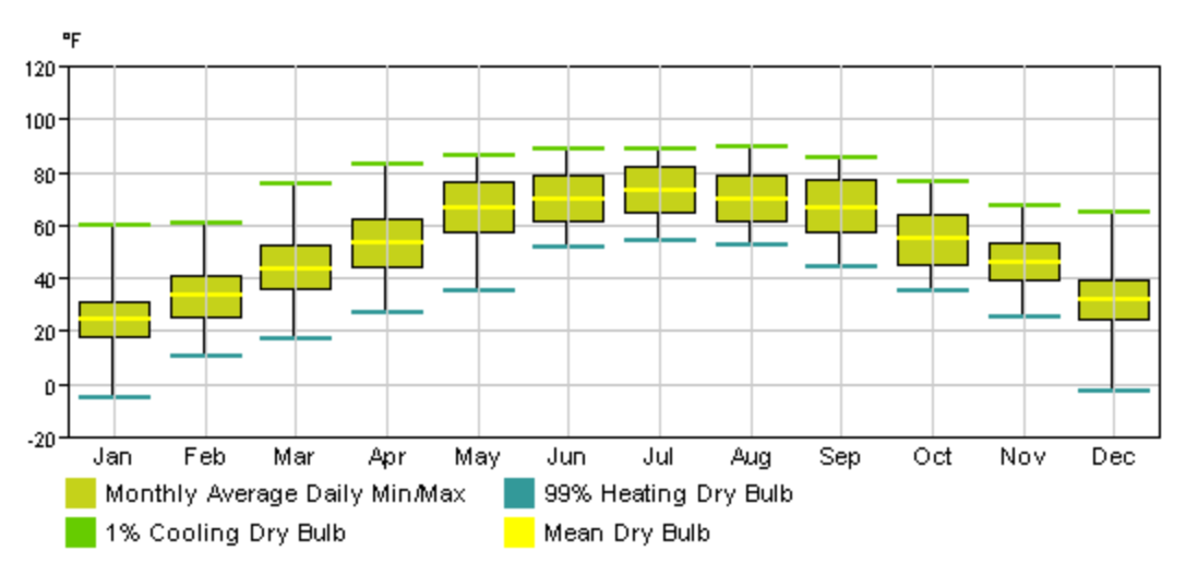
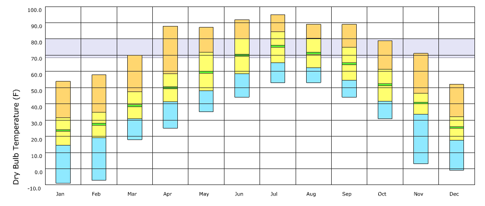
Meanwhile I was being requested to do Bar Chart like the image shown below for EPW data:
(stack or shown min/max)
Here’s couple of my try … am I using the wrong components?
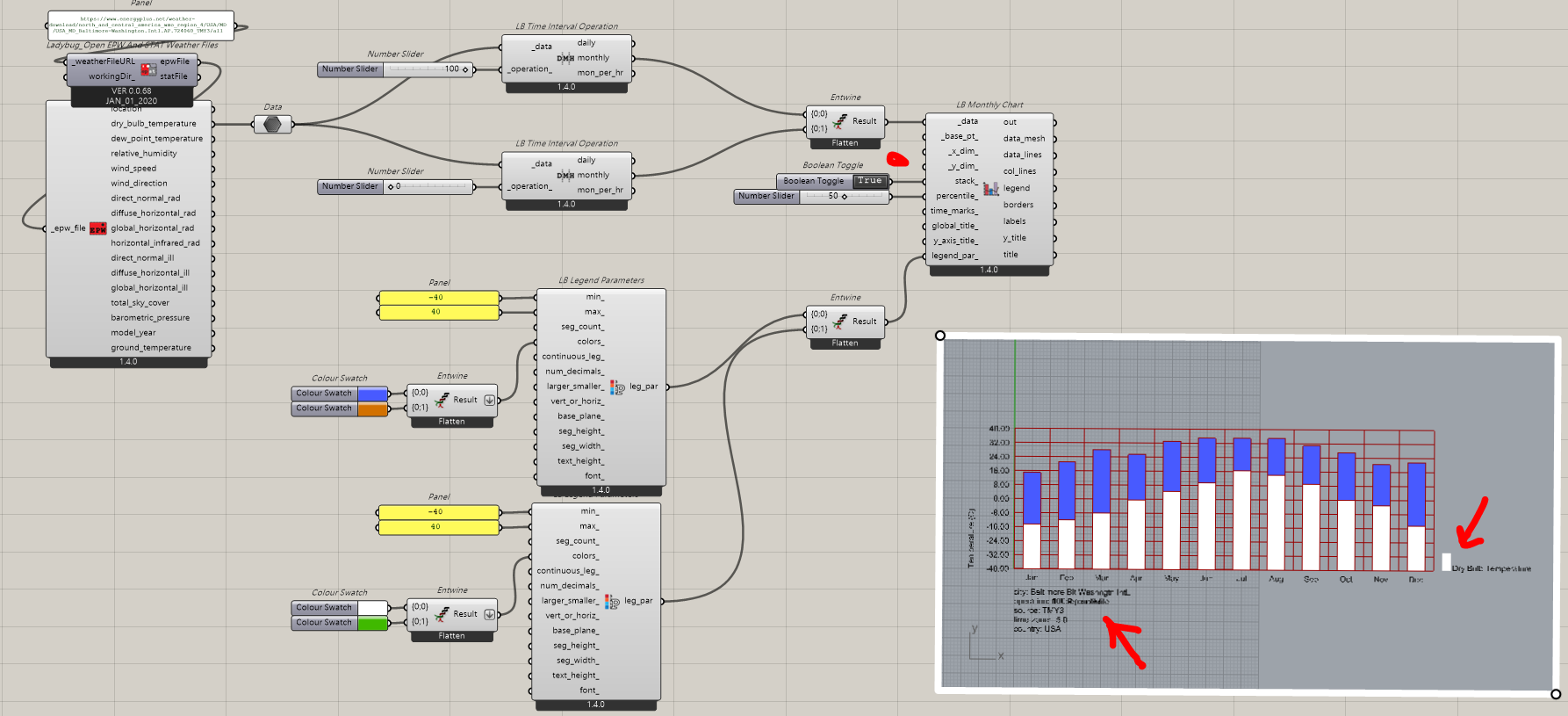
Hi there,
Need a little bit help…
Meanwhile I was being requested to do Bar Chart like the image shown below for EPW data:
(stack or shown min/max)
Here’s couple of my try … am I using the wrong components?
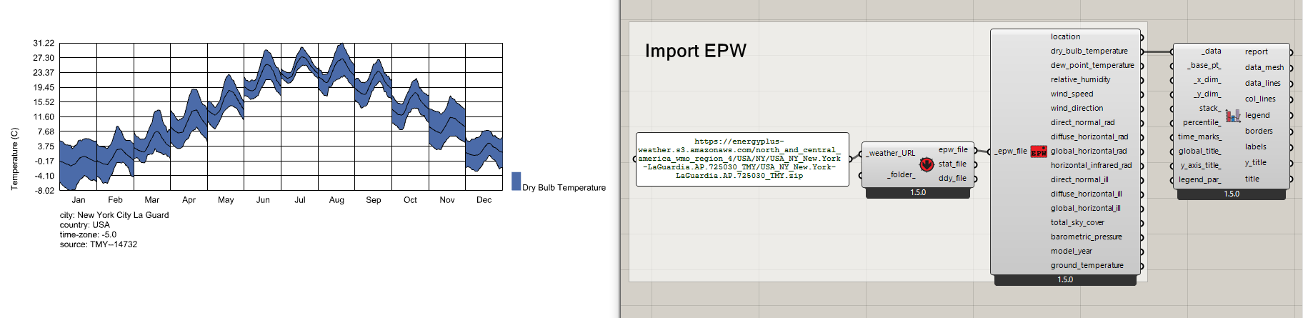
Box and whisker plots are not supported with the current Ladybug Tools components but I imagine that you can set these up in Excel pretty easily if you really needed them.
FYI, you can connect the hourly data typically used to make these box plots to the “LB Monthly Chart” component, but you’ll get plots of the diurnal pattern of the data in each month rather than a box plot.
Oftentimes, these diurnal plots give you a little more helpful information than just a box plot.