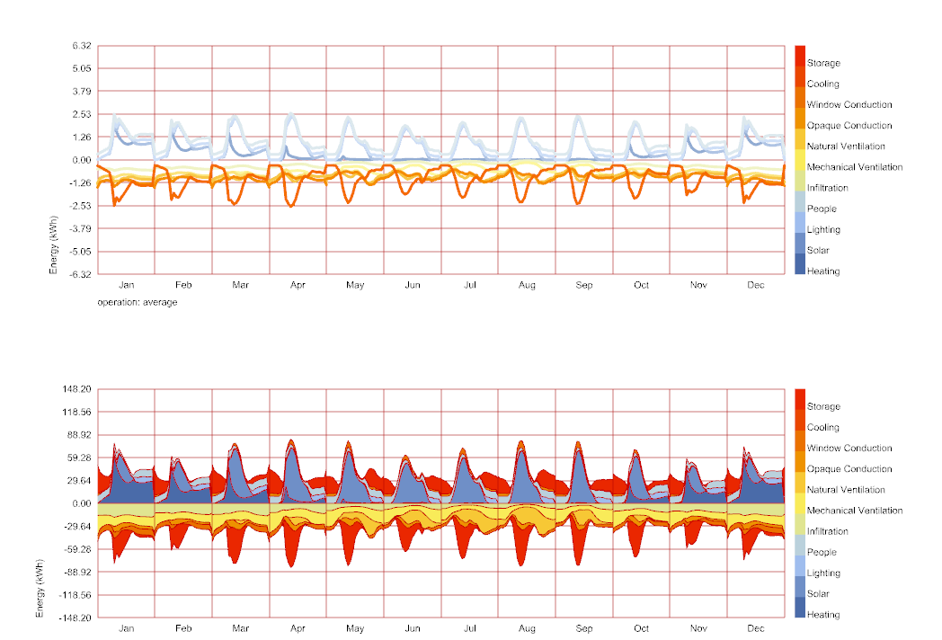
I would to generate a stacked graph showing the average monthly energy balance curves. But when I use the time interval operation the graph turns out wrong. (energy storage is always negative!). Also the meshes are not showing up.
You found a bug here in the MonthlyChart class that only affects “Monthly Per Hour” Data Collections when the stack_ option is set to True. I’m going to fix it shortly but I can already sense that, even with the fix, you want something different than what the “Monthly Per Hour” Data Collections can offer. This is because “Monthly Per Hour” Data Collections always display with colored lines and not colored meshes.
The stacked mesh display on the monthly chart is only supported when you use Hourly Data Collections and the data type is something that can be can be summed to produce a useful number. For example, you cannot stack data collections of temperature in Celsius but you can stack data collections of Energy in kWh. The thought is that, if you can’t sum the hours of the data to make something reasonable, then a stacked mesh is not going to make much sense. So we just ignore the _stack input for cases like temperature.
We carry this “summing” logic through the monthly chart by always summing the hourly values for cumulative data types rather than averaging them.
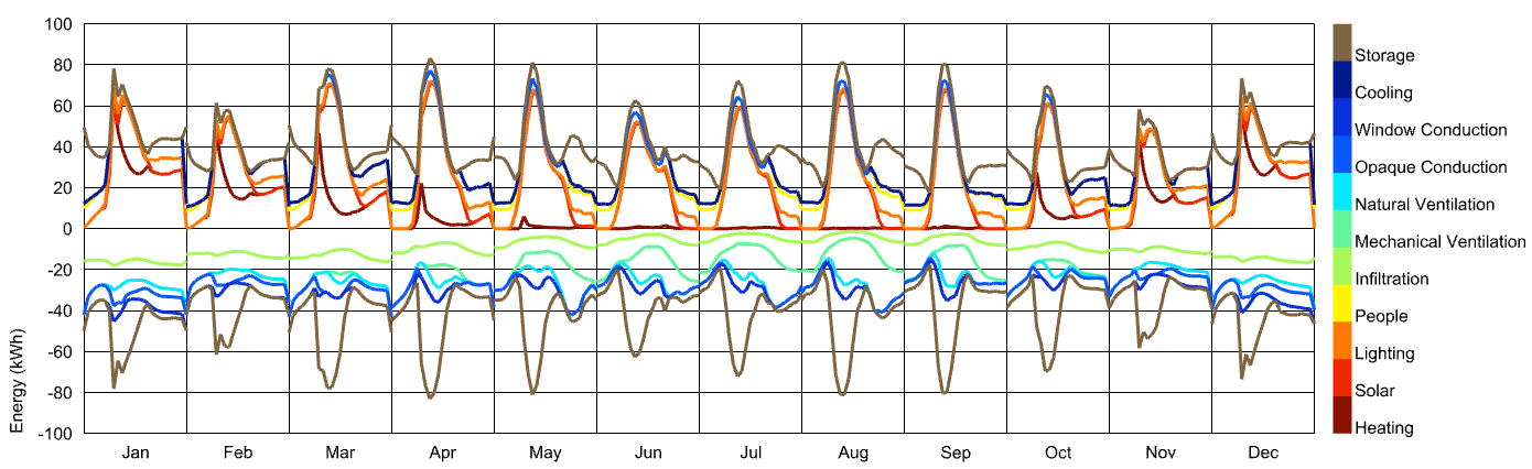
Long story short, if you want a stacked mesh visualization of your data but with average values, you need to be a little more creative than just using the “Time Interval Operation” component. Specifically, you’ll want to make a new set of data collections where each value is divided by the number of days in a month. This can be done in Grasshopper but I think it’s a little more elegant in Python: