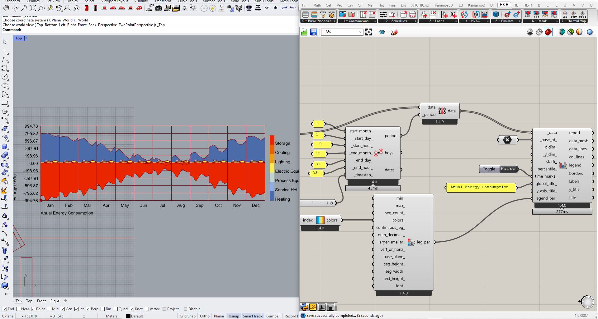
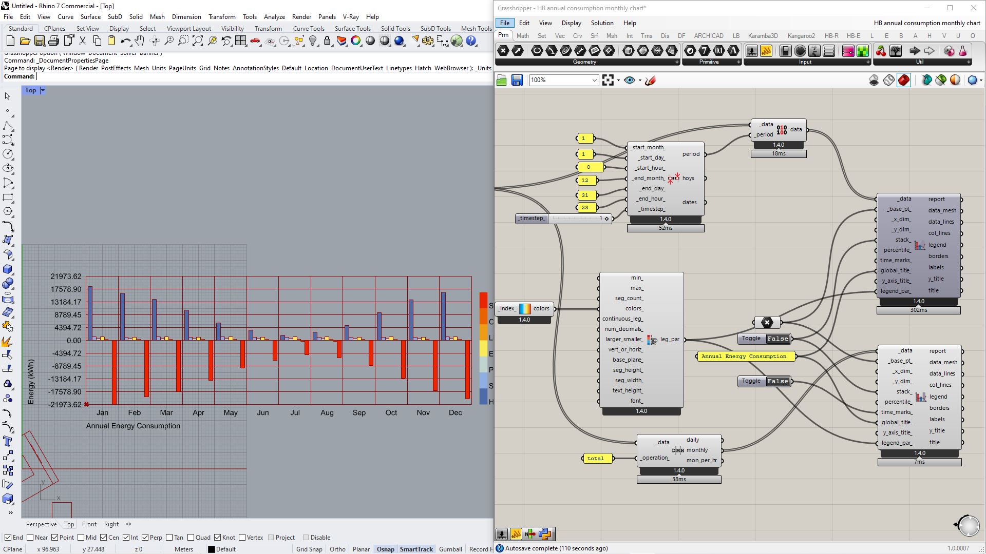
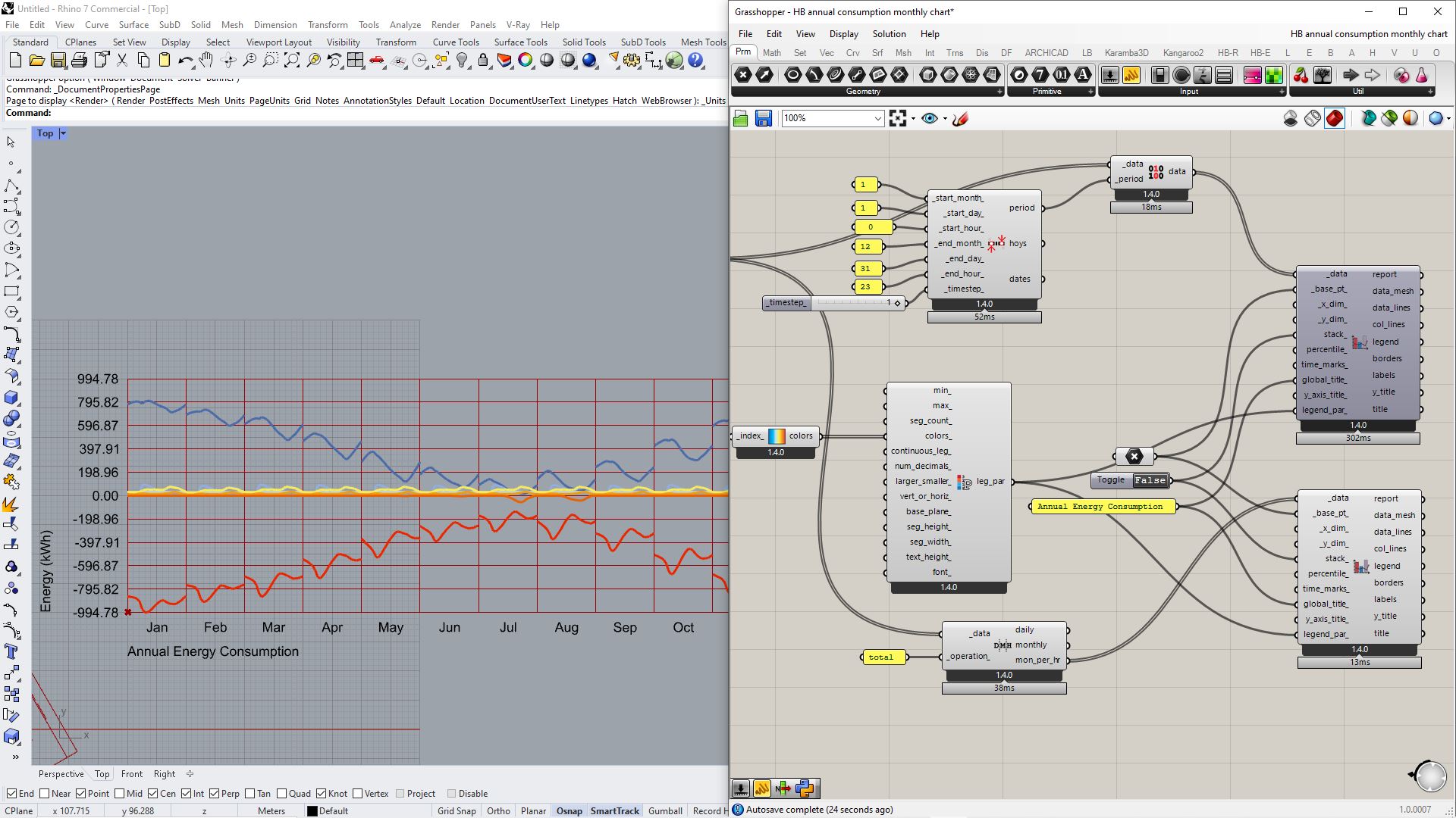
I want to have a monthly chart of annual energy consumption but the result looks like daily consumption in each month. It has also jumped between each month which makes me sure the result is not correct.
I’ve changed the Analysis period inputs but the chart shape for each month doesn’t change at all.
(unit in Rhino should be meter)
Happy to hear all answers.
Thanks
HB annual consumption monthly chart.gh (139.5 KB)