Hello!
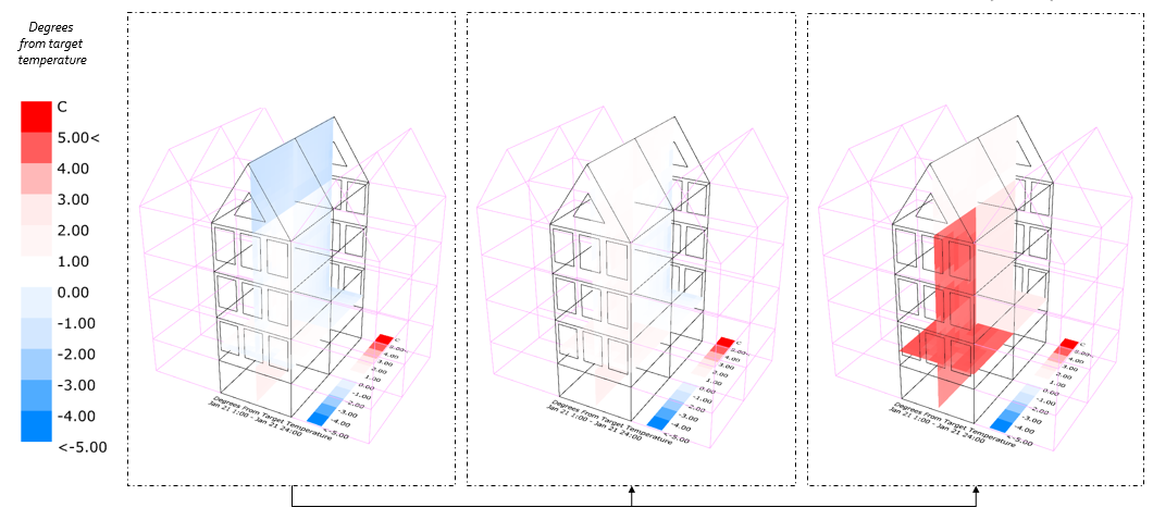
I’ve created a few microclimate map (using heating design day, January 21) for the same building geometry with different levels of insulation.
Left scenario: non insulated building
Middle scenario: insulation roof and walls
Right scenario: insulation roof, walls, floor and new windows
The settings are:
I don’t really understand the right picture:
- The pic (with high level of insulation) shows that the temperature is +5 degrees higher than the target temperature. Does the target temperature is in my case 21 degrees on January 21 (= heating setpoint)?
- Does this mean that on January 21, the heating is not on (because it’s warmer than 21 degrees) but the room still overheats because of the high degree of insulation?
thank you!