Hi @mkdg,
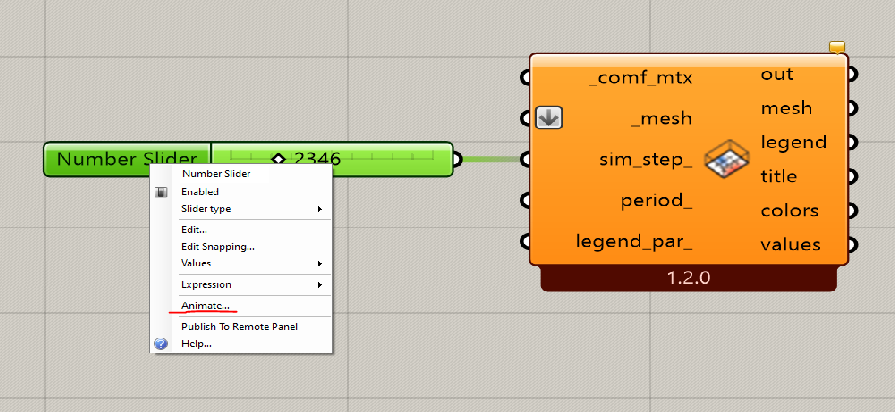
As far as I can see, you are visualizing the average of a whole day. So the average temperature is +5 degrees higher then the target temperature (21 degrees during setpoint hours and 12 degrees during setback hours). If you want a better understanding you can make an animation for each hour of the day using the timestep. Be carefull just use 24 values (limit the slider)