@LelandCurtis, @chris
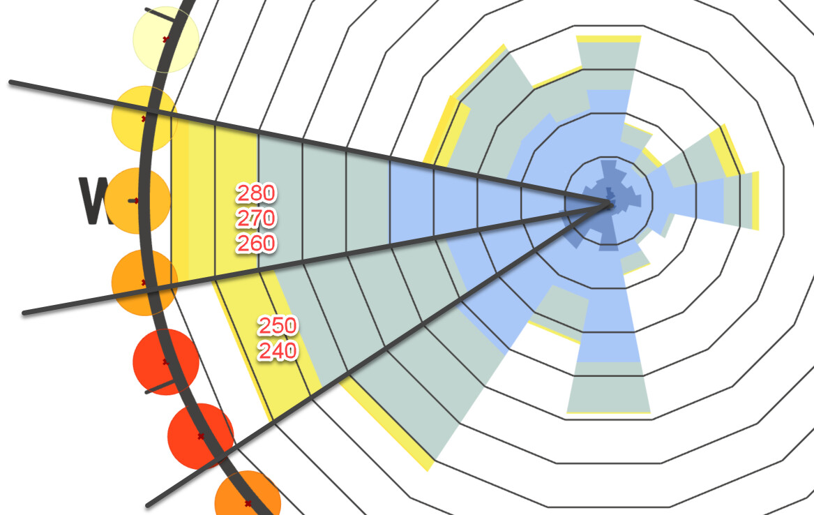
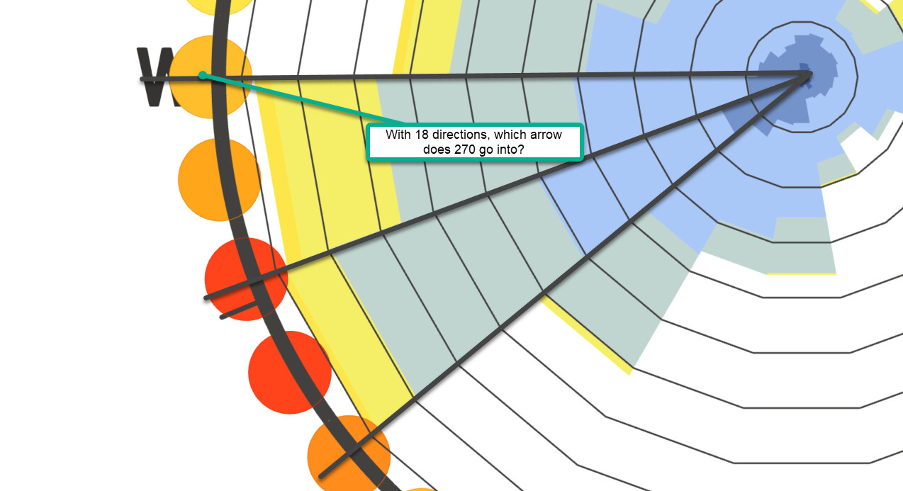
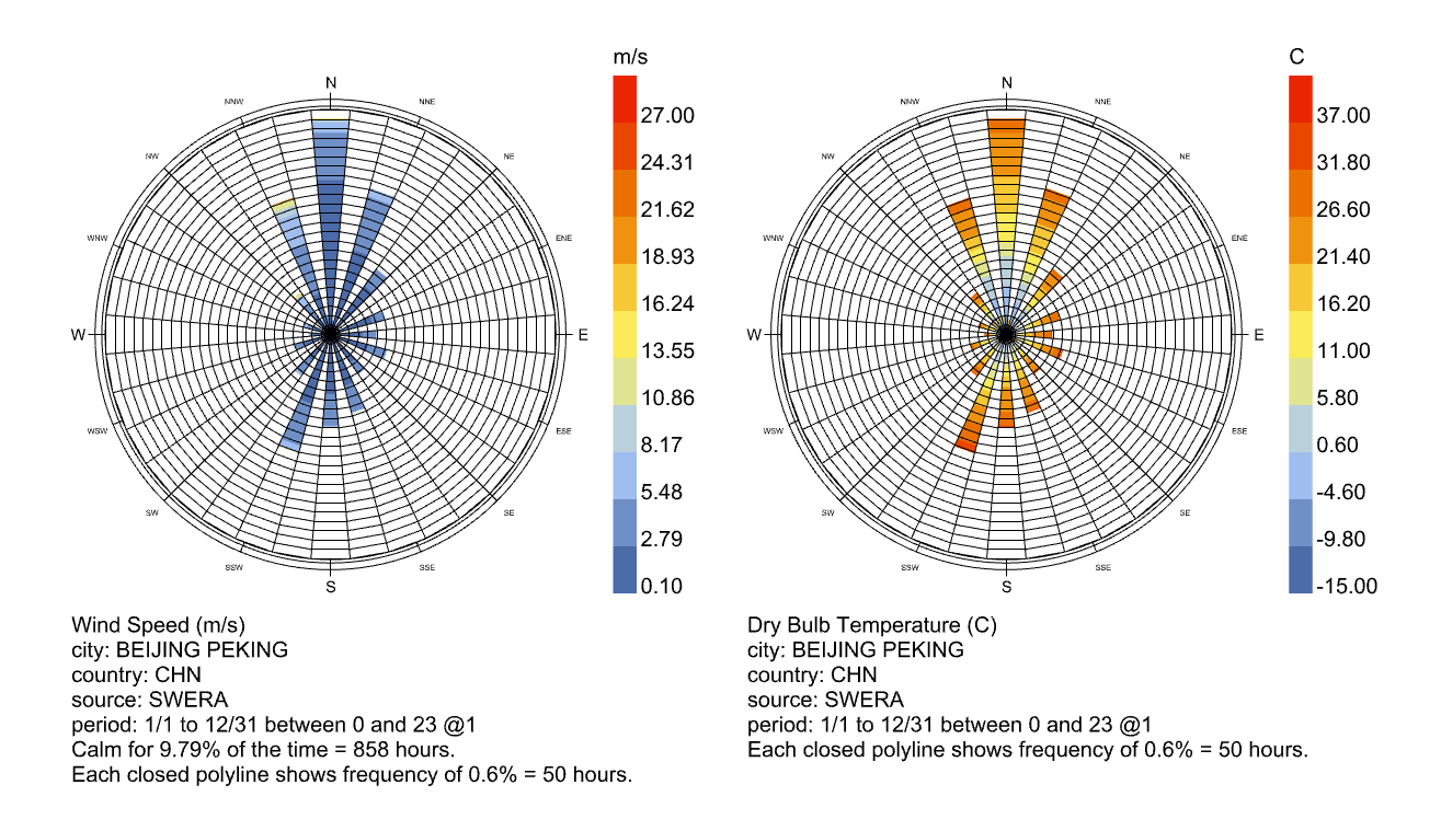
That’s right, there are non-10 degree wind intervals in EPW files! Thank you for reminding me Chris, this is one of those facts that I always learn, and then promptly forget for some reason.
As for a strategy of accommodating such intervals, I would argue that we are going about this the wrong way. Right now we are debating (a) trying to find a common factor for some common subset of EPW intervals or (b) adding a series of tests to check bin intervals. In the first case, that common factor may not exist, and we are accepting it will be broken by custom or exotic datasets. For the second option I suspect the logic we’d be using to try and identify which bin intervals are inappropriate will have to be very convoluted to account for all possible scenarios, and still might be brittle.
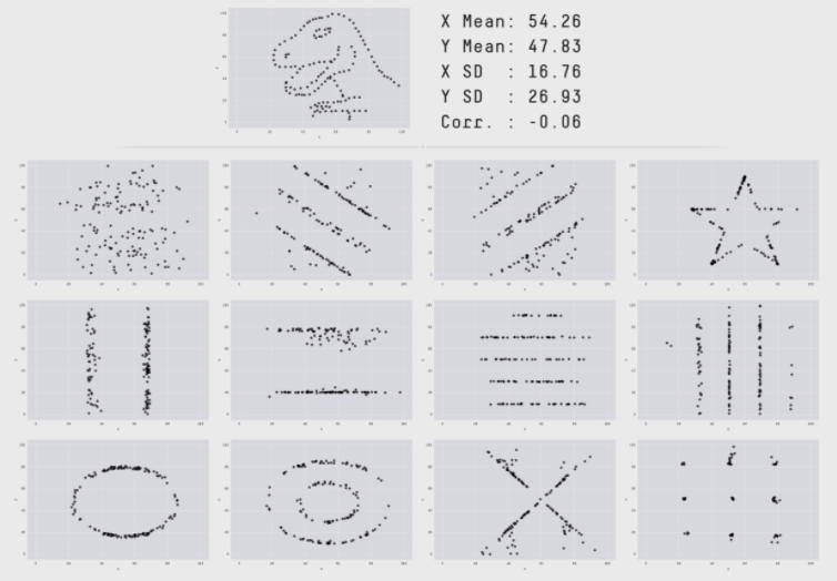
Specifically, we falling into the dilemma captured by Anscombe’s quartet. Anscombe’s quartet illustrates four datasets that have identical descriptive statistics, but differ greatly when graphed. Here’s a modern example of Anscombe’s quartet called ‘The Datasaurus Dozen’, which illustrates the same average, deviation, and correlation with widely varying datasets:
Anscombe quartet illustrates the importance of visualizing data (especially data prone to outliers) before analyzing it numerically. That’s why every statistical workflow starts with visualizing data, even for extremely high-dimensional data (using methods to project the data down to 2 dimensions for visualization like t-SNE or PCA).
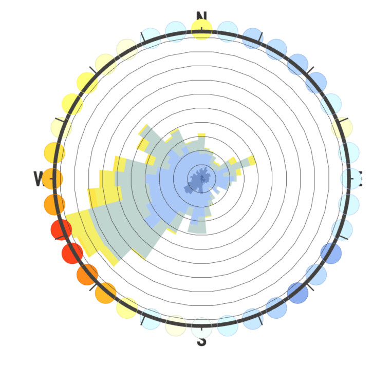
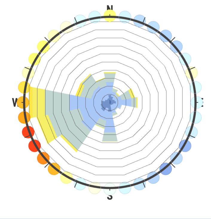
So I would argue we are ignoring the effectiveness of just plain data visualization by a human to identify the skewing of the windroses based on poorly-chosen intervals. And that’s why I think the use of 36 bins is our best option, because it’s so thin it most clearly illustrates the underlying distribution of the EPW sample, and users can then modify the interval number as they wish to approximate the weather population (sample being a rough measurement of reality which in statistics is called a population).
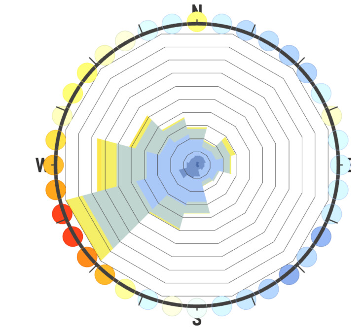
I agree that in the case of the SWERA Beijing file, 36 intervals is “wrong” but it’s actually wrong in a different, more useful way then Leland’s example at the top. That is, it doesn’t mislead us with a slightly rotated set of wind directions by clumping frequencies too broadly, but instead explicitly shows us that the measurement intervals for this dataset are very coarse, and in that way also intuitively implies the solution of increasing the bin interval width to better represent the population distribution.
It’s not perfect, but I think using 36 intervals will actually be the most robust against the kind of user-error we are worried about, versus other numerical methods of capturing skewed direction frequencies due to different sampling intervals. What do you guys think?