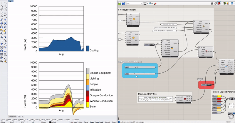
I have spent an hour canvassing the discourse for any discussion on this topic but unable to see anything. Could anyone clarify why the ‘Line Chart’ component in the Ladybug legacy versions did not find its way into the new 1.3.0 version? I really found this line chart of great use when trying to look at multiple data sources over a single small period (a day/week) to identify correlation/causation. And on using v1.3.0 I see that this is not possible using the Monthly Chart component which requires a full annual data source to populate.
@chris 's Visualise peak loads hydra file demonstrates this capability, which I’m not sure is achievable in v.1. Hydra Viewer
Has anyone reached a workaround to generate a line chart of a smaller subset of data to do this?
We haven’t yet ported the line chart component over to the LBT plugin because the current LB Monthly Chart component is capable of doing most of the things that we used Legacy Line Chart for. For example, this statement is not really correct:
The “LB Monthly Chart” can display any hourly continuous data collection, whether its for a day or a week, etc. For example, you can see how it’s used in this shoe_box_peak_loads.gh sample file that downloads with the Food4Rhino installer.
At this point, the few things that the Legacy line chart component could do that the “LB Monthly Chart” cannot do are probably better done Excel. This isn’t to say that we might not add a Line Chart component eventually but this is the reason why it’s a lower priority at the moment.
Hi chris,
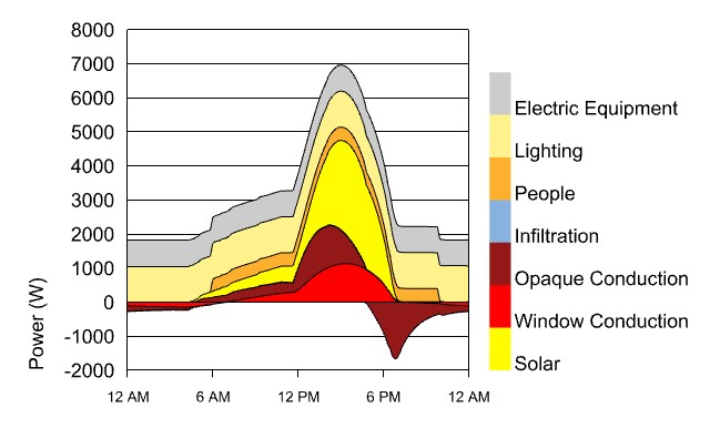
Sorry to trouble you again about this issue. I would like to know how to get the result with the time x_label instead of the month x_label as you showed in the second picture above. Because I tried to input period of one day, but the result is still shown with the month x_label as your first pictures above shows.
Thank you so much for your attention.
You will see that the latest version of the LB Monthly Chart component has a time_marks_ input on it. Just set that to True and you will see that the chart is drawn with times on the X axis instead of the Month name.
Hi @Chris,
When I set the time_marks_ input to true it does draw the chart with time on the x-axis.
However, the description of the LB_monthly_chart says that hours will be plotted as a line when inputted, but, when I try and plot one week of hourly temperature data, it instead plots some sort of monthly average. I may not understand how to plot a line of hourly values using this component, is there a specific way to achieve the desired result.
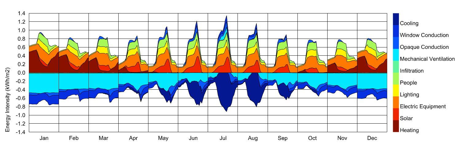
Right. When you plot a data collection of multiple days on the Monthly Chart, you’ll just get the average daily profile with a default percentile of 34 on each side (for one standard deviation). This is usually clearer when you have a lot of days of data and you’re just trying to get a general understanding of what those days are like.
If you need to see each day individually, you should use the native Grasshopper QuickGraph component or just plot things in Excel.
I want to creat line chart with 12 data for avrage indoor temparture in a building but in LBT I can’t do it. In pervious version I can creat line chart. Can I just creat bar chart in LBT? Does this mean that if I don’t have hourly data I can’t have a line chart?