Hi All!
Im trying to plot the results of Airflow network simulations on the Honeybee model as vectors indicating the air flow on the model itself.
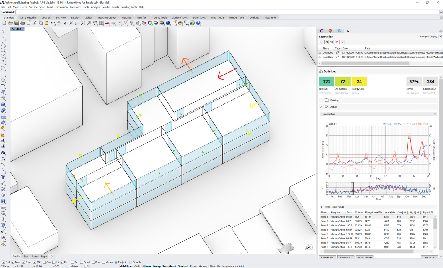
This kind of visualization is available in Climatestudio and Designbuilder software (Screenshot of desired output attached). This is extremely helpful to analyse the flow rate results and design openings / roof exhaust systems efficiently.
The challenges im facing:-
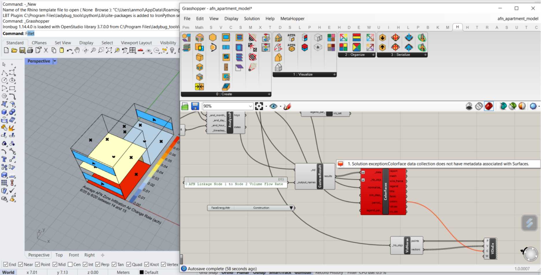
Im trying to plot the results of ‘AFN Linkage Node 1 to Node 2 Volume flow rate’ on the surfaces using read custom output and color faces.
This throws an error - Colorface data collection does not have metadata associated with Surfaces.
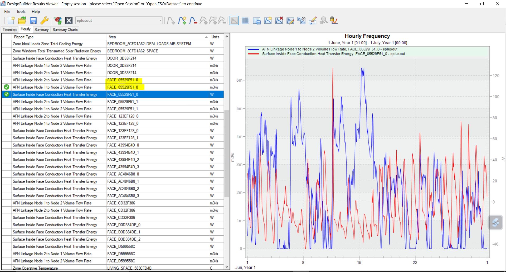
As far as the output from simulation is concerned I do believe that this output is associated to Surfaces (please see the screenshot of the ESO file showing various surface outputs).
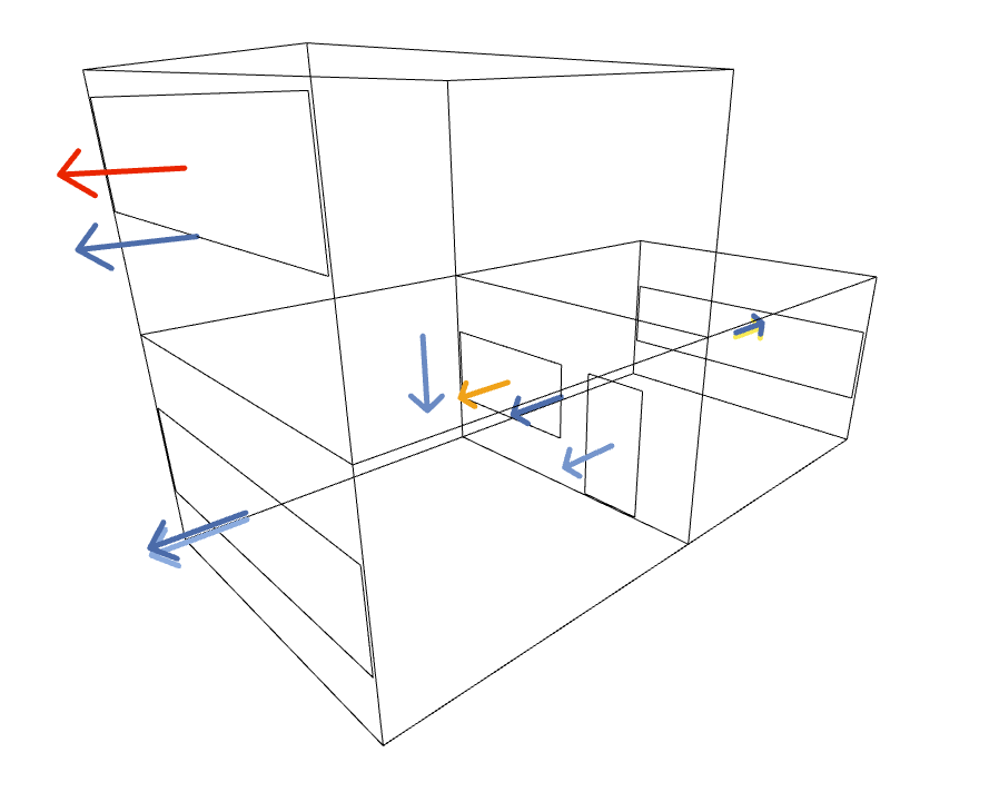
Has anyone attempted doing this before and can help me get an output like this (image attached)?
You were close to having it. It seems needlessly annoying that EnergyPlus puts the name of the Surface under the System property instead of the Surface property like all of the other Surface-level outputs. But I guess they have some reason for it. In any event, copying the name of the Surface over the a Surface key in the metadata only takes ~5 lines of Python:
    data = []
    for dat in _data:
        new_dat = dat.duplicate()
        new_dat.header.metadata['Surface'] = dat.header.metadata['System']
        data.append(new_dat)
So that’s all you really need and then you can get the Honeybee Faces colored with their air flow rates:
Granted, I think you’ll need to find an AFN output that gives you the direction of flow through each of these Surfaces in order to make the final visualization you want. But hopefully you now have the building blocks to get to where you want. Here is the file:
I’ve noticed something unusual in the results. All window airflow rates show positive values and flow towards the outside of the building. This seems counterintuitive, as I would expect at least some windows to have incoming airflow (negative values) to maintain air balance in the building.
I might be misunderstanding some concepts about AFN. Could someone please explain.
You might have missed the last part of what I wrote, @todtad :
The script that @Anmol23 initially put together just used the normals of the geometry not the actual flow direction. So we have to find a different E+ output that reports the direction of flow in order to make the arrows meaningful.
Hi @chris some months back I tried the same but could not find that part in Energyplus to convert that into inlet outlet output. Please help us in this!
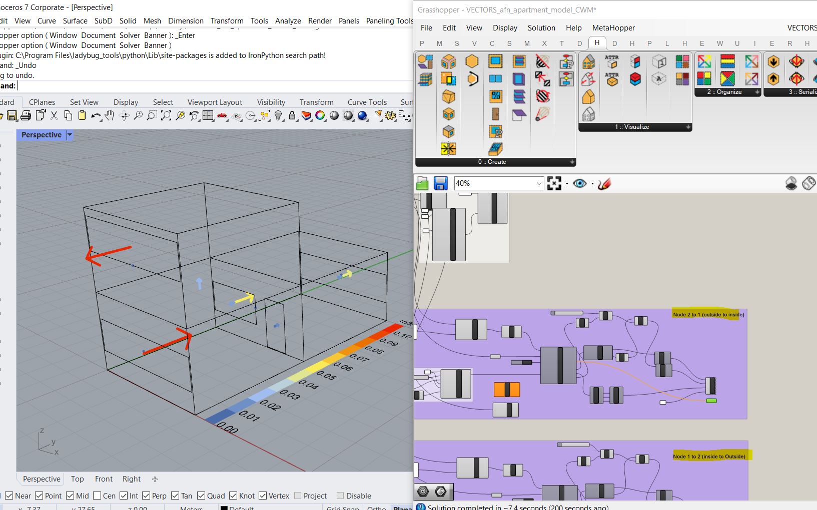
Hi all @chris@todtad@Asisnath i tried to add few more steps to view the vectors. If you look at the Energyplus input output reference definition for AFN Linkage Node 1 to Node 2 Volume Flow Rate and AFN Linkage Node 2 to Node 1 Volume Flow Rate [m3/s], it indicates that Node 1 to Node 2 usually depicts - “The value of AFN Linkage Node 1 to Node 2 Mass Flow Rate represents the flow rate from a thermal zone to outdoors.” (Group – Airflow Network: Input Output Reference — EnergyPlus 9.5). So going by this logic on every node there will be some flow inside to outside and some flow outside to inside. So we can either plot the “Net” flow from one Node by subtracting the values or we can plot both flows simultaneously. So Ive tried something that gives a reasonable depiction, where the length of the vectors and colours represent the flow rate and the directions are represented by plotting both results outputs. Do check this out. VECTORS_afn_apartment_model_CWM.gh (159.1 KB)