Hi everyone, new here
I’m trying to create a box plot that shows averages of the monthly highest and lowest dry bulb temperatures, basically recreating the monthly design temperatures graph by Ecotect using ladybug.
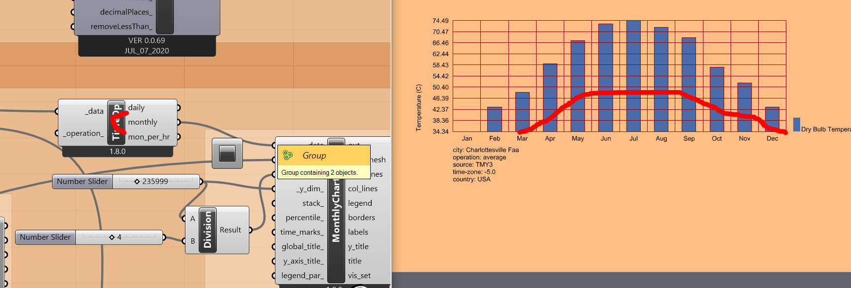
This graph is a very useful and simple visual tool that shows at a glance the temperatures that must be designed for.
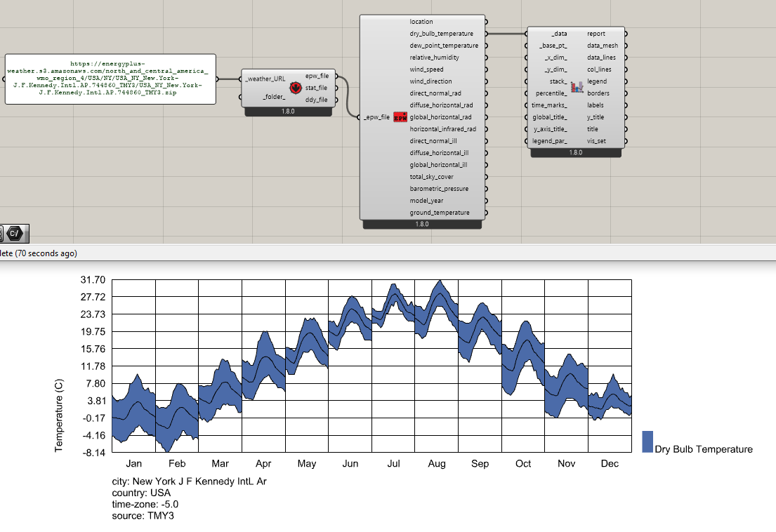
I’ve seen that LB_selectAndAverageData has been suggested in previous posts but I’m using the latest ladybug version.
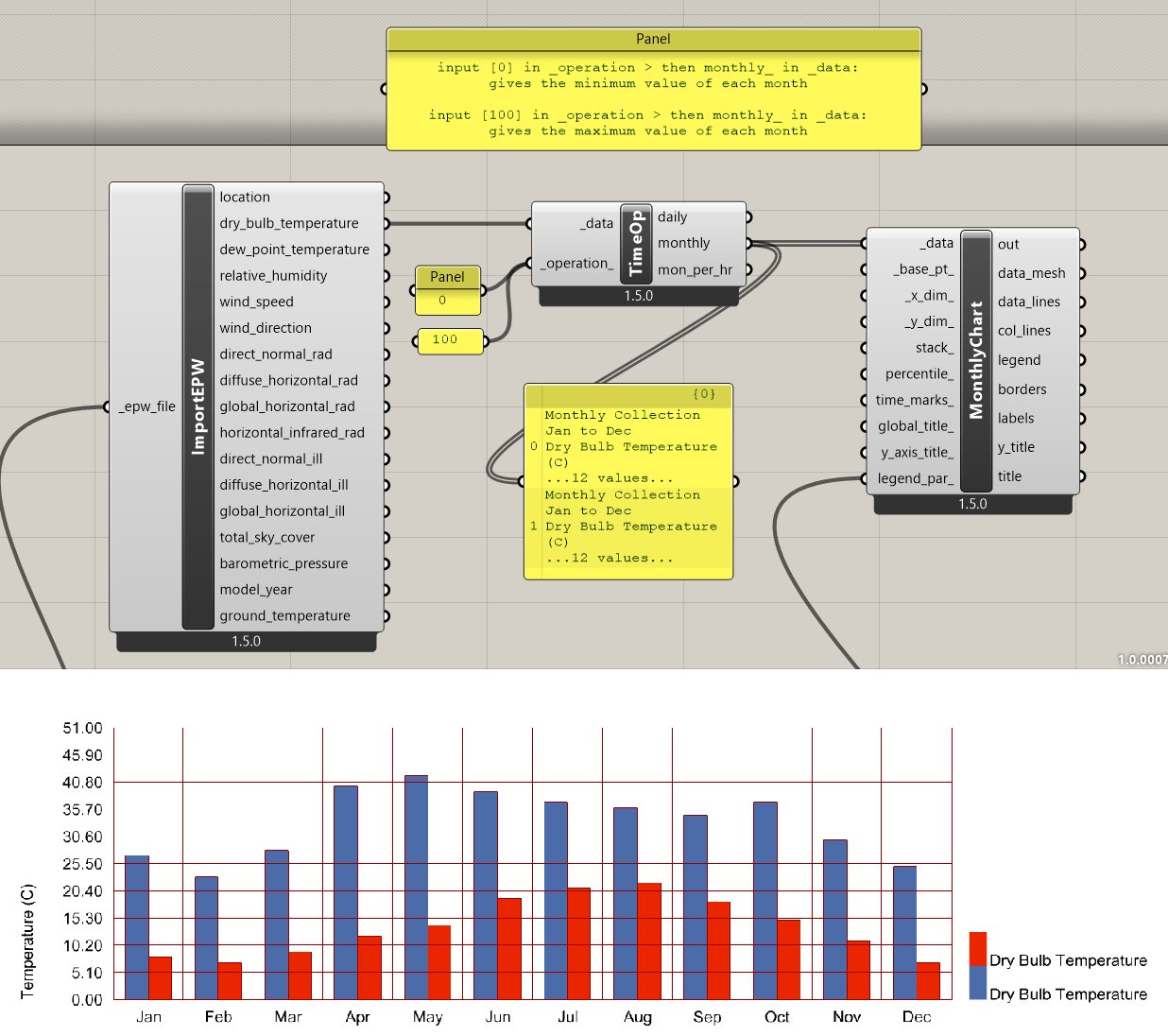
Creating a simple bar chart using LB Monthly Plot and LB Time Interval Operation has the graph beginning at 0 instead of the minimum monthly temperature.
Does anyone know if I can calculate the minimum and maximum monthly dry bulb temperatures using a combination of LB Monthly Plot and LB Time Interval Operation?
If anyone has any ideas or tips that can help me get started it would be much appreciated!
thanks 
Update1: I’ve managed to extract the max and min monthly averages, but the problem remains that values begin at 0 and now each month is represented by 2 bars.
Any ideas on how to combine the max and min for each month into a box plot?
thanks