Hi @chris,
I tried to make a stacked data chart folowing the same principle as used by the HB thermal load balance putting the different dat into one list. But somehow the data does not get stacked.
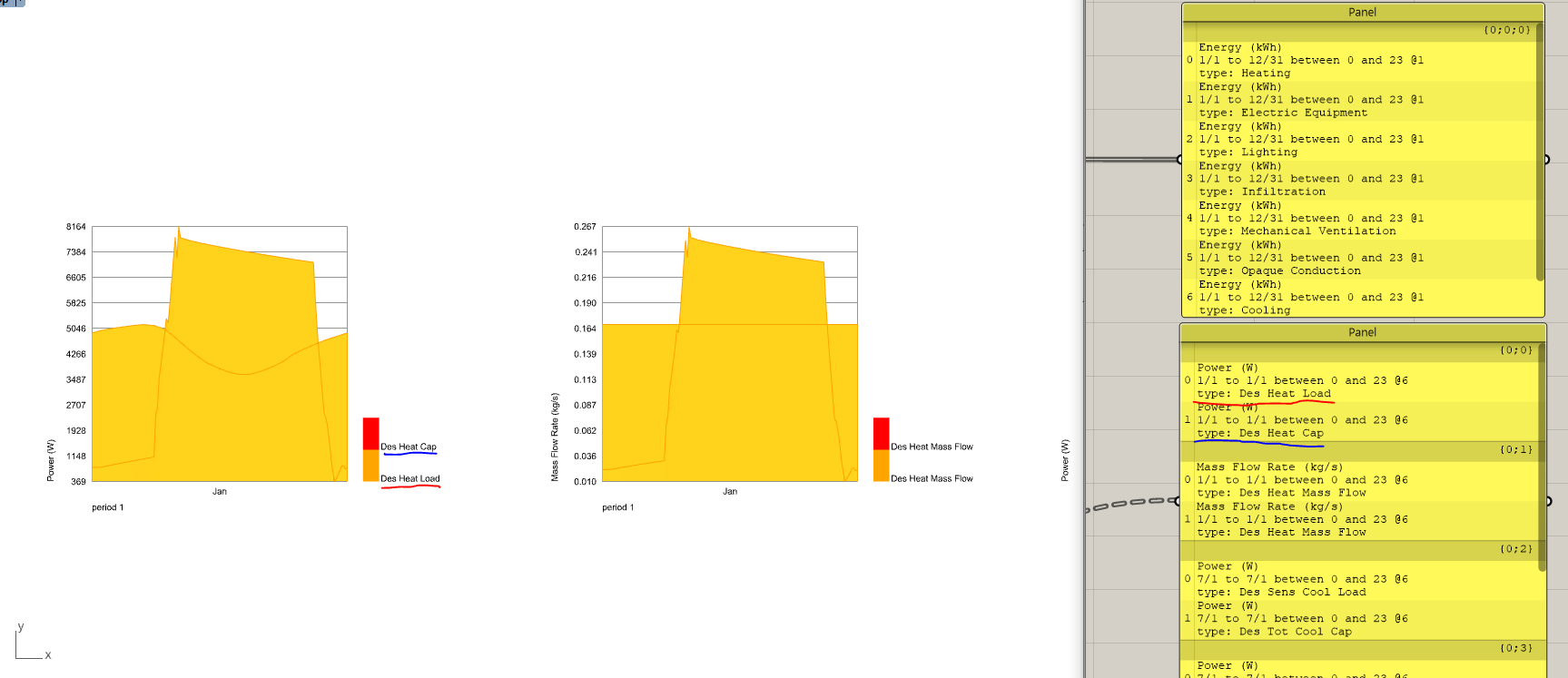
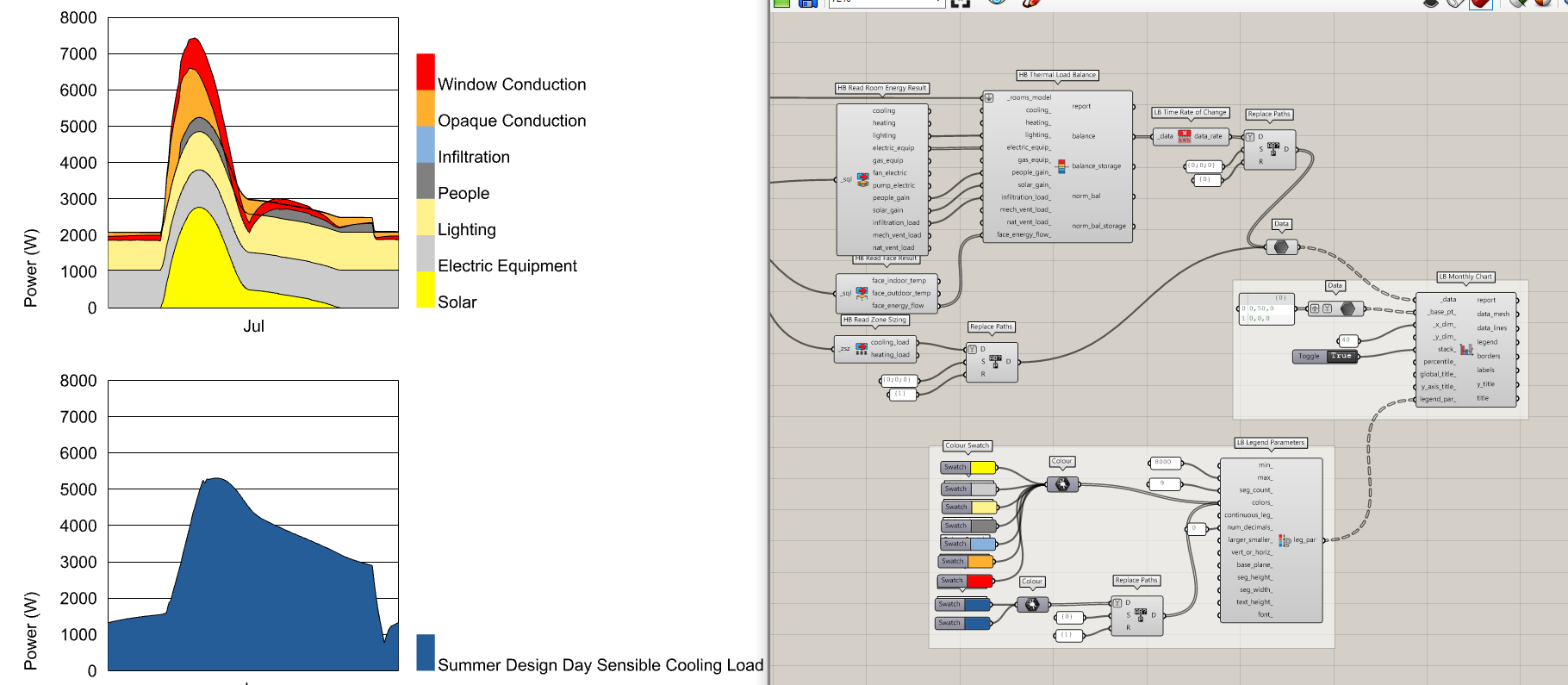
HB thermal load balance chart:
Input Header
Hi @chris,
I tried to make a stacked data chart folowing the same principle as used by the HB thermal load balance putting the different dat into one list. But somehow the data does not get stacked.
HB thermal load balance chart:
Input Header
Hi Erik !
I think there is two way to get monthly stacked data :
The first one is to get result by month with simulation parameters, but with this method there is no way to exploit hourly result (not generated)
Put the “hourly” parameter on “monthly” :
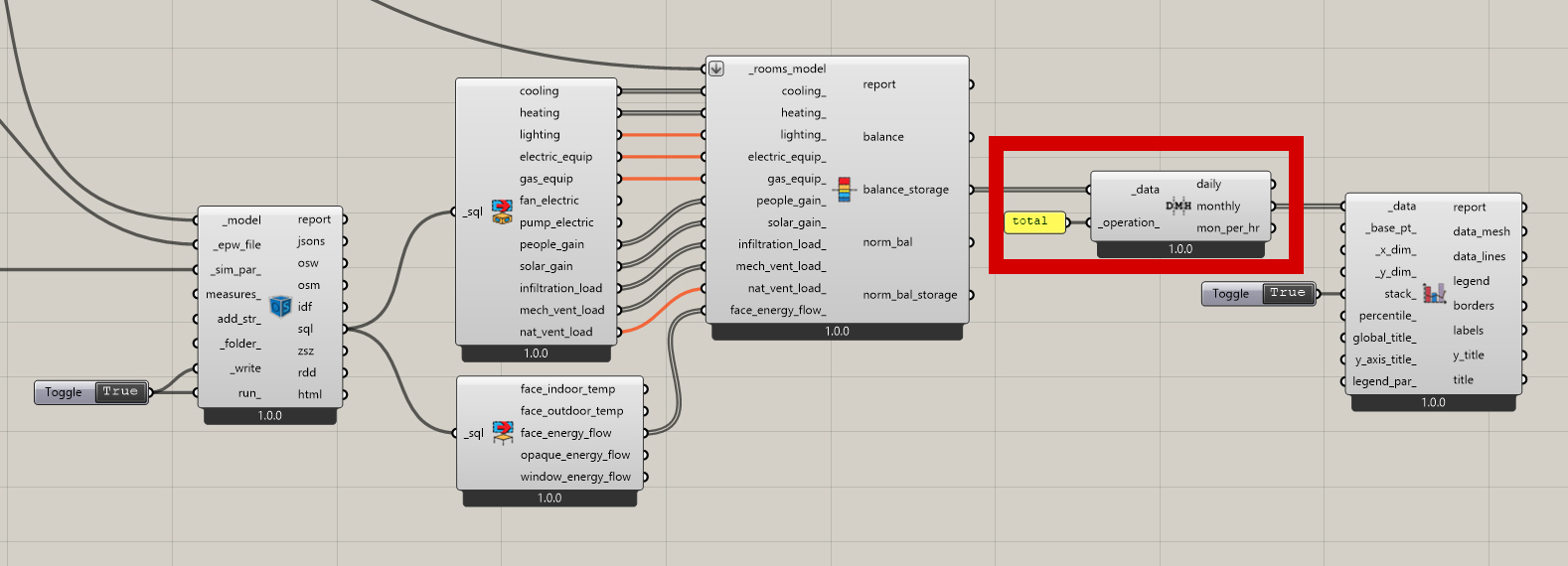
The best way is to use the component LB time interval operation on your results :
The parameter Stack is only graphical for the output on rhino :
I hope this answers your question. Have a nice day 
Hi @Numa.Latourte,
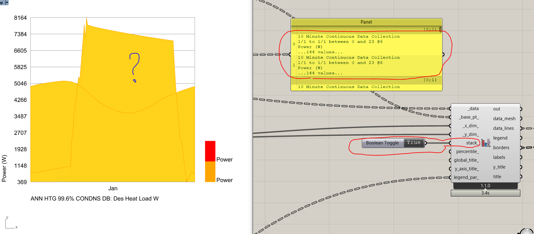
Thank you for the sugestion. I tried the component but it only stacks the data in horizontal direction. Values of a month can be avaraged or summed. But I would like to stack the data in the vertical direction, like in the monthly HB thermal load balance chart. But somehow there is data lacking and I do not know which.
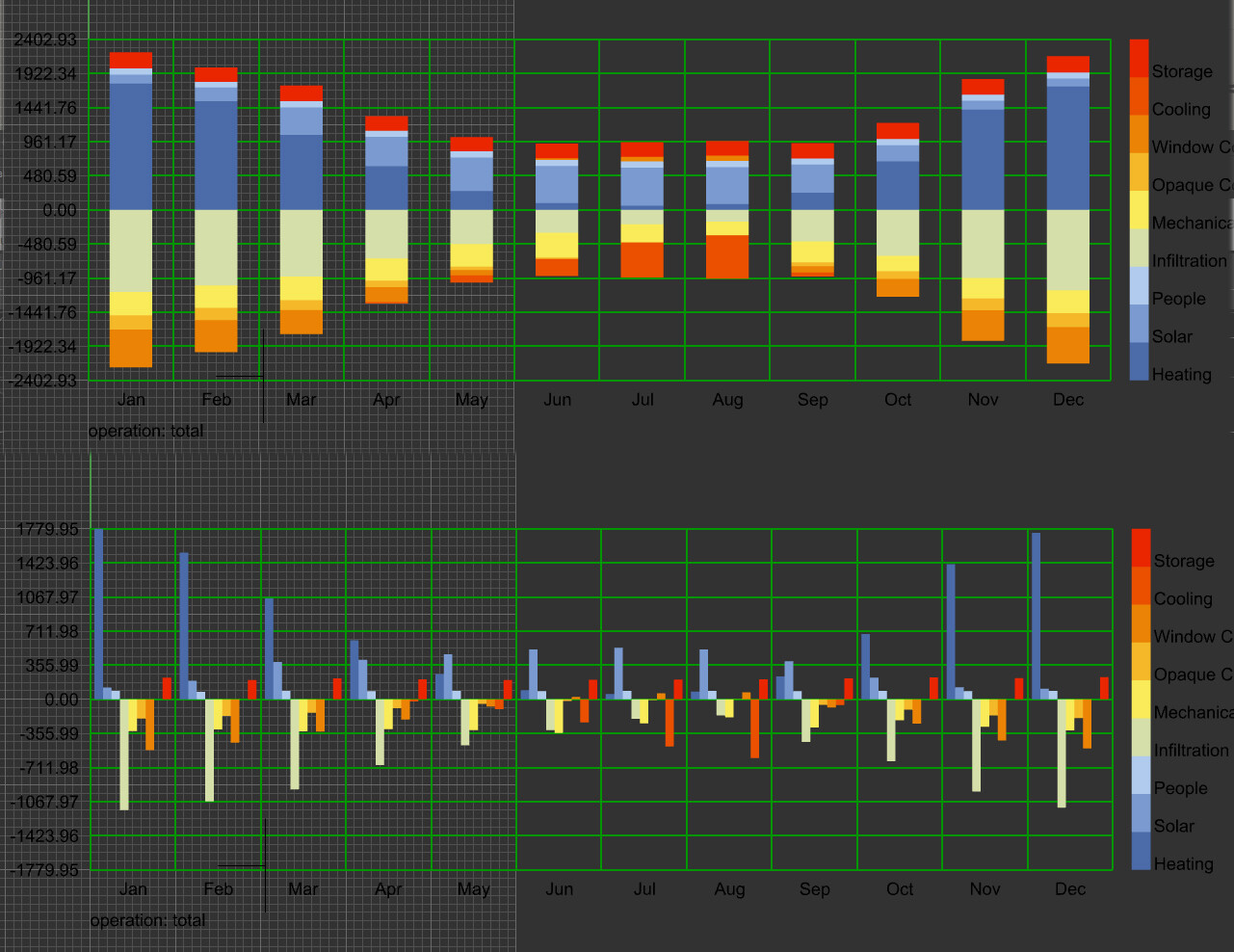
It’s because the data is in Watts, which is not a cumulative data type (like energy). The chart similarly doesn’t stack data types like temperature or illuminance since summing these values usually doesn’t yield a meaningful metric.
Because turning the Power data type into a cumulative metric would create some difficulties elsewhere in the plugin, I think I would sooner recommend that you convert your data collection of Power values in W to a data collection of Energy in Wh (since energy is a cumulative data type). Because I can see this conversion from W to Wh being a common operation, I think I’ll add a dedicated component for it. But, for now, you can deconstruct the data collection and then reconstruct it with the energy data type. Then, you’ll be able to stack it.
I’m just letting you know that I decided to make a couple of changes after mulling over the situation here:
I added two new components to the Ladybug “Extra” tab that allow you to time-aggregate data collections or convert them to a rate-of-change metric. So this allows you to convert data collections in W to kWh and vice versa (accounting for the data collection timestep in the process). It will also work for converting between things like volume and volume flow rate, though I expect the Power/Energy conversion to be the primary task they are used for most.
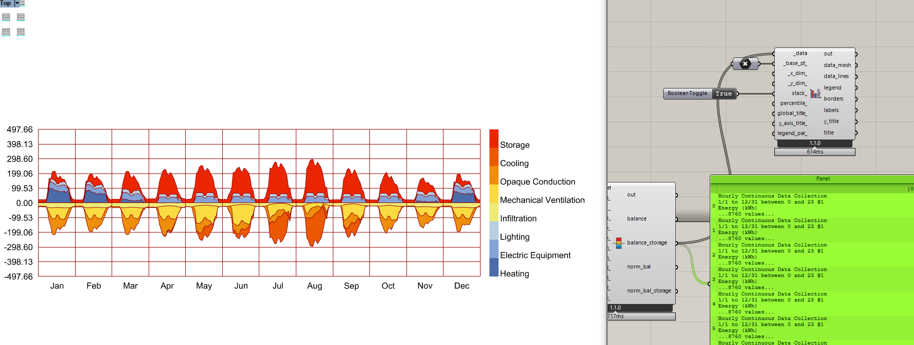
I decided to make it possible to stack certain data types on the monthly chart IF stack_ is set to True and the data type has a time-aggregated equivalent. So this means that metrics like Power, Flux, and Mass Flowrate can be stacked but metrics like Temperature, Relative Humidity, Illuminance, etc. cannot be stacked. I believe this is desirable for cases where people want to plot stacked energy and one of these non-cumulative metrics on the same chart. Importantly, if stack_ is False or None, metrics like Power still behave like Temperature and the other non-cumulative metrics (that is, they get averaged instead of totaled). But the ability to stack them means that you can now easily construct visualizations like the following:
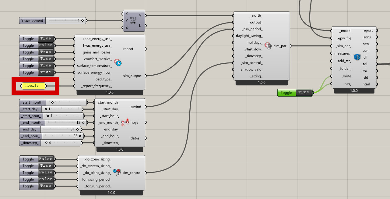
On a side note, I am thinking of adding a “HB Peak Loads” component that works much like the “HB Annual Loads” component in that it will be very fast but aimed at only computing summer/winter peak loads along with the load diagrams in the image above. At the least, I think this will make it much easier for beginners to evaluate the impact of their decisions on HVAC size/cost since you can see the workflow above takes quite a few components to set up. Let me know if you have any thoughts here.
Really nice @chris! Thank you!
Just one more question. Why is there no component to read the system sizing file (eplusssz.csv).
To have a better notion of what is going on during sizing the Ladybug charts are realy helpful.
The system sizing file containes also lists of 144 values.
Next to that I use the charts also for visualising values from the ddy file.
There is a component that does this and you can actually see it in the screenshot I posted above. It’s called “HB Read Zone Sizing” and it effectively parses the eplusssz.csv into data collections at the simulation timestep. You’ll see that data is what’s plotted on the lower of the two charts in the screenshot.
The only current limitation of the ZSZ component is that the eplusssz.csv file does not contain any information about the dates of the summer/winter design day. So, when we parse it in now, the data collections are always for January. I think there won’t be a way to get the correct date unless the user supplies another input that contains the design day information. This could either be the .ddy or a .sql. I’m leaning slightly towards the .ddy but let me know if you have a preference. In any event, it will just be an optional input to set the dates correctly on the output collections.
Really happy to see you making use of that feature. I know that we have practically zero tutorial videos and sample files making use of the “LB Import DDY” right now but I’m really glad to see yo could figure it out by reading the component descriptions.
+1 on this. Most of the calculations at the office are only for peak loads, that would be so much more straighfoward ![]()