@Navid,
Kit’s method here should be mathematically correct, it’s simply a type of global sensitivity analysis.
If I understand your criticism correctly, you believe this visualization is conflating different, linearly independent values (wind, solar) together in such a way that the resulting UTCI outputs aren’t accounting for how different variables impact that output. Hence your criticism that wind and solar values cannot be compared against each other, as they are based on different units.
I believe we can prove that this is not the case, by thinking about this visualization in 3d space, where each dimension corresponds to a wind, solar, UTCI value. The reason this is helpful, is that it allows us to intuitively “see” that values along each axis are linearly independent of each other - no linear combination of wind vectors alone can be used to produce a vector along the solar axis, and vice versa. Thus they are not being compared against each other, or conflated, just as you are saying.
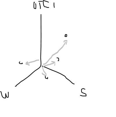
A 3d vector in this space illustrates the respective contributions of wind, and solar and specific values to the UTCI output. So, if we do a bunch of simulations and generate different UTCI values, with different solar, and wind values (and some default, fixed values for other variables), all of that is clearly tracked along the different axis. Importantly, we can quantify the impact of solar radiation on UTCI, relative to a wind baseline, and vice versa. This is a mathematically valid way of representing the relationship between our inputs and outputs, and is subsequently mapped to the monthly analysis done by Kit in a way that correctly preserves the linear independence of our input parameters.
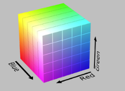
Specifically, this is achieved by taking the wind and solar dimensions and representing them by colour, rather then axis geometry. Colour preserves the linear independence of all the input parameters, and thus is able to communicate the respective contributions of solar and wind. The benefit here is that we can then do this for every month along a second analysis, and represent 4 dimensions of information in 2d (wind, solar, UTCI, month).
You can even the derive the coloured visualization from the 3d space I describe. Just convert our wind and solar coordinates to an appropriate colour (something like this):
And then remove those two axis. This effectively projects our 3d vectors to the 1d UTCI. Obviously the actual visualization is a little more simplified then this, more like this:
Blue: UTCI where Wind < Wind Baseline, and Sun Baseline (and baseline values for all other inputs)
Red: UTCI where Sun < Sun_Baseline, and Wind Baseline (and baseline values for all other inputs)
Hence, we can say that solar radiation has more of an impact on UTCI, then wind speed, given the underlying baseline conditions.
Make sense?
S

