Hello,
I have used UWG to obtain dry bulb temperature
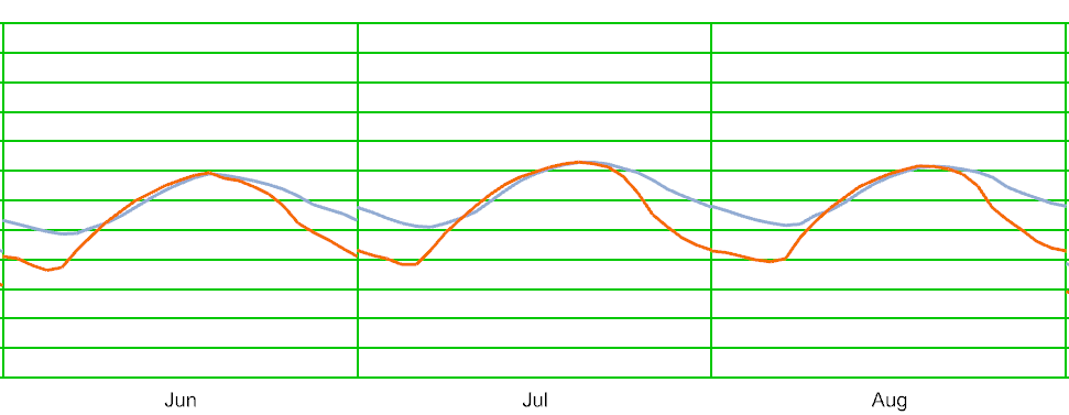
In the first one I have used the period : day: 29 month 6- day :1 month :8 and I obtained the following result:
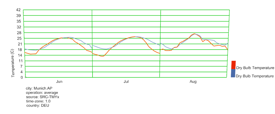
When I perform a whole year data I obtain the following figure for the 3 previous months
So the months of June and August are completely different. Is it because in the first run we have only 2 days from June and 1 day of August and it takes them as average hourly data in a 24-hour span of the month of June/August, while in the yearly run, we have 30 days for June and 31 for Auguse so it takes hourly average considering all the days of the month?
I wanted to confirm if this is the logic.
Moreover, wanted to ask is there any method to show all hourly data in a month not an average but all 744 hours in July as example?
Thank you for your help!