Hello,
I am doing some visualization of the dry bulb temperature coming from the rural (in my case airport) and the one generated from UWG the urban ones.
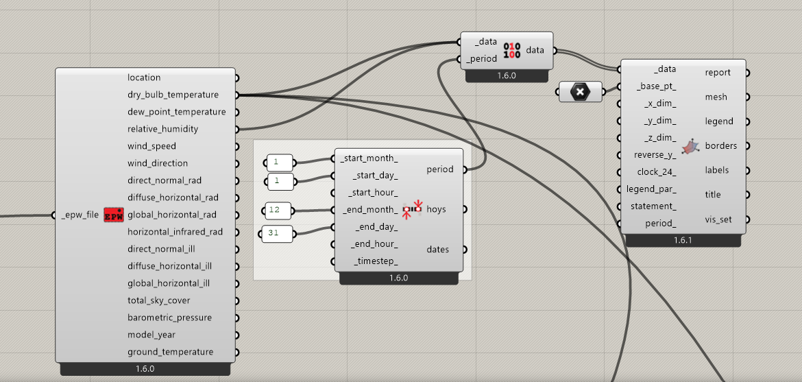
I tried to plot their difference (airport data - urban data) but I couldn’t find a way to do it. Can you please suggest me a method and guide me?
I would really appreciate it !