Dear Ladybug community,
When implementing a hybrid system (eg. Heat pump combined with a gas boiler), I would like to calculate how many hours during the year the coverage of the heat demand can be ensured by the heat pump. As an example, I would like to get such a graph from my energy model:
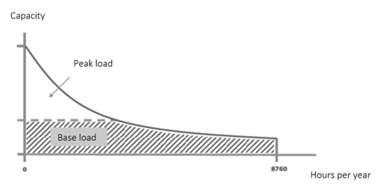
During the hours where it’s very cold (peak heating loads), the existing boiler kicks in - while the rest of the year the heat pump is sufficient to cover the remaining of the heat demand. The goal is to understand how much CO2 you can save up by implementing a hybrid heat pump scenario vs status quo (only gas boiler).
In this example, the visualization only includes the design day: Hydra Viewer