Hi everyone, first of all, good sunday to you all
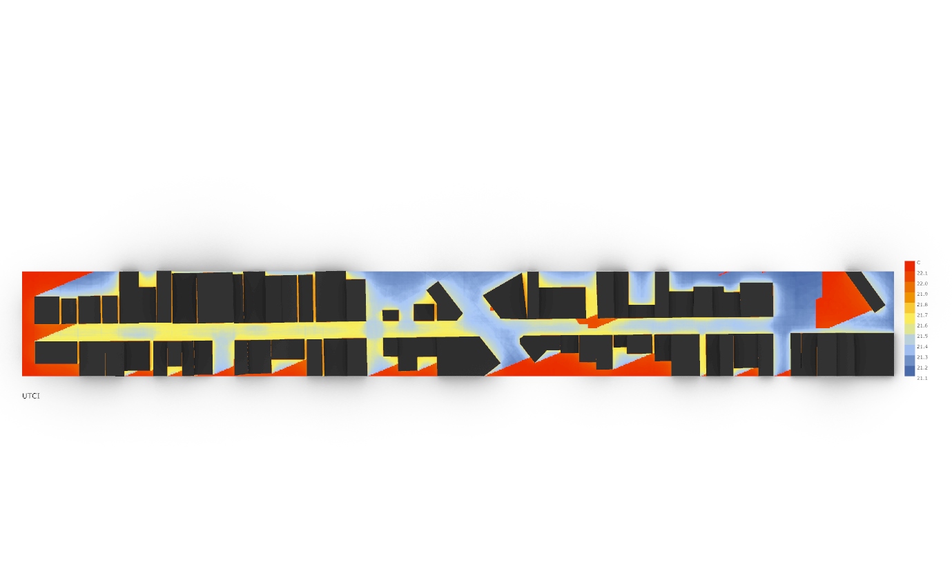
I’m running a UTCI analysis through Ladybug on both summer and winter’s solstice, and by 6PM I’m getting these weird results, only on this timestep this is happening, by this time the sun has set, so, it was supposed to be no sun at all.
This first image is on the summer sosltice, by 6PM.
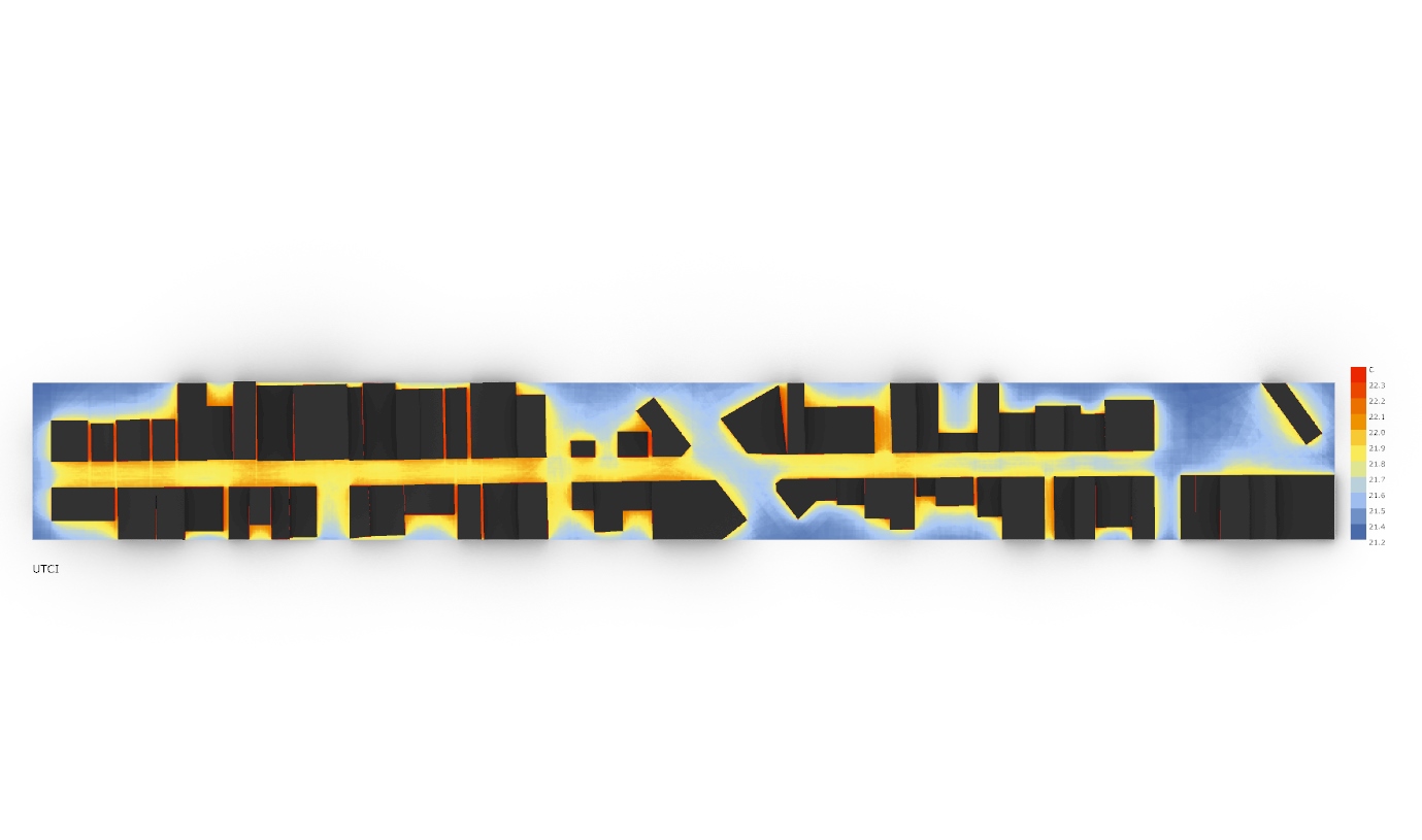
Here’s an image, 6PM on the winter solstice.
Do you guys got any idea why is this happening? Here’s the file I’m using with geometry internalised.
I’m trying to run kind of the same analysis through the new LB 1.2.0 to see how it goes
UTCI MAP LB NOVO - Copia.gh (502.8 KB)
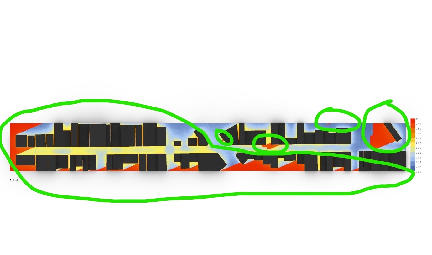
Not sure what is the problem that you see, but what is really weird for me (and i suggest you to think about it) is that the whole scale range is 1 oC. Drawing conclusions from such narrow range is doubtful, specially when this can be in the margin of calculation error.
In addition the scale (and results) are in the comfort domain (9-26).
-A.
1 Like
Hi @AbrahamYezioro, thanks for the answer.
What seems weird for me are the heat spots highlighted, given the fact of the solar angle on this time of the day would be low, almost setting. this time step was supposed to behave like the second image, so, it was supposed to be all “blue” like on the second image and the heat spots would center on the inside of the urban canyon.
About the scale range, would this be because of the climate file? My city has altitude tropical climate, and I’m assessing a timestep which the sun has set. Maybe thats the reason?
D.C
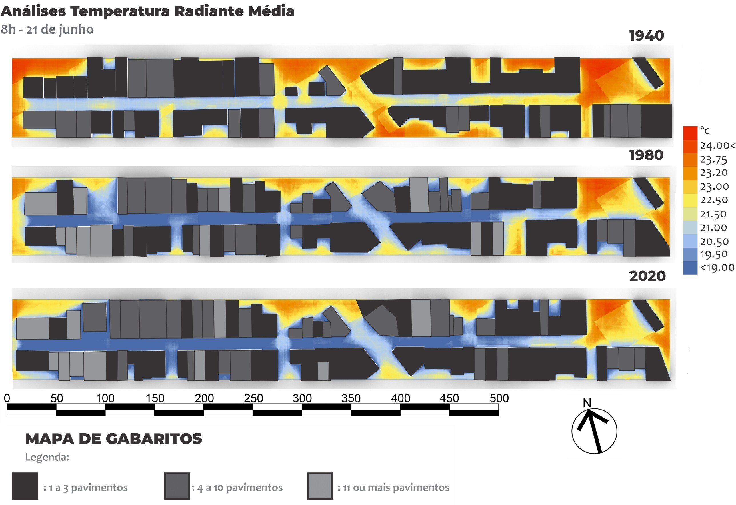
I’m doing these analysis for an article, basically I modelled this urban canyon from my city on 3 different times in history (1940,1980 and 2020), for these past urban morphologys I morphed the EPW file through UWG in order to try to estimate how the urban microclimate would behave in that time.
But still, is this scale range not acceptable to make any assumptions? Is there some sort of workaround I can do to debug this?
Thank you for your time
What i think is that 1 degree difference on the extremes of the scale is too narrow. The color is not important, the numbers are. Since the calculations are not as accurate as measurements i would say that 1 degree or less difference is in the margin of error you can expect. I will suggest you to think how to explain this because probably the reviewers will ask (i know i would). If at the other times of the day (not only at 6 pm) you have bigger differences you probably need to use a unified scale for all cases so you can really see the differences at a specific time but rather at all times you revised.
Sorry if i’m too harsh …
-A.
1 Like
No apologies needed, not being harsh at all and you’re being trully helpful and I really appreciate it! I will pay close attention to the values range on other simulations.
This is the result for another simulation, same morphology, same .epw file and analysis period.
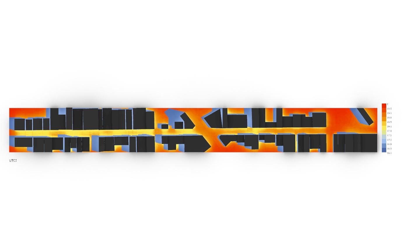
This one is for 8AM. the range is about 3ºC
This one is for 1PM, and the range is about 14ºC.
For this article in particular, I tried to unify all scales from every timestep I’m analysing based on the max and min value exposed on every simulation, so all values would be included in a single scale, based on this image below (this one is not UTCI analysis, this one was performed by HB, but I’ll try to make the same for the UTCI analysis I’m doing through LB).
The gray scales on the bottom are the building’s height based on 1-3 storeys, 4-10 storeys and etc, since I’m assessing both morphological variables and how the built density inteferes on the urban’s thermal comfort.
Sorry for the rusty english by the way, long time not practicing, and thanks for your help as well, I’ll make sure to quote thanks to you, Chris, Devang and everyone that’s been helping me on my master thesis.
@Dconforte,
If you haven’t already done so, I recommend checking out Nakano’s 2009 thesis on UWG, she does a similar sort of study examining the impact of UTCI on different neighborhood developments through time. More importantly, she is quite skilled at being able to extract useful information from the simulations despite the seemingly very small changes in temperatures when examined using typical metrics. For example, she computes a histogram of UTCI outputs, so that she can capture the change in outlier (extreme hot) temperatures.
If you are concerned about margin of errors in your analysis, you can quantify it using a Monte Carlo approach: model a range of input values, run multiple (like ~1000s) simulations with a random sampling of those inputs, then use the sample outputs to identify the contribution of chance error. This is all outlined in this thesis, which contains an uncertainty analysis for UWG[1]. Just be aware this does require some solid understanding of statistics before attempting.
[1] Based on me eyeballing the graph in the paper, and assuming their reference to percentiles in the uncertainty section refers to the percentile of the sampling distribution of predicted mean, I believe they find a margin of error of around 0.7C for summer, and even less for winter in Abu Dhabi.
3 Likes
I will surelly check Nakano’s 2009 thesis, thank you Saeran!