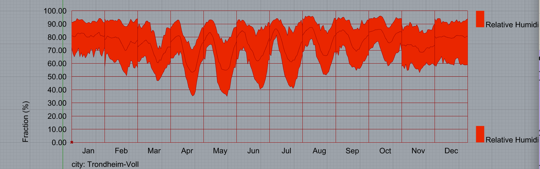
I took the relative humidity of a EPW file and input that as the data for a monthly chart:
I understand correctly that the middle line shows the average of the days of that month, but what does the range show? Anecdotally I’ve been told that the top and bottom lines show the 5% highest and lowest relative humidities of that month, but where can I find this information directly? This is for academic work and I need to know black on white what the monthly chart component is doing to the data.
They are just showing the minimal/maximal values. No mystery there.
-A.
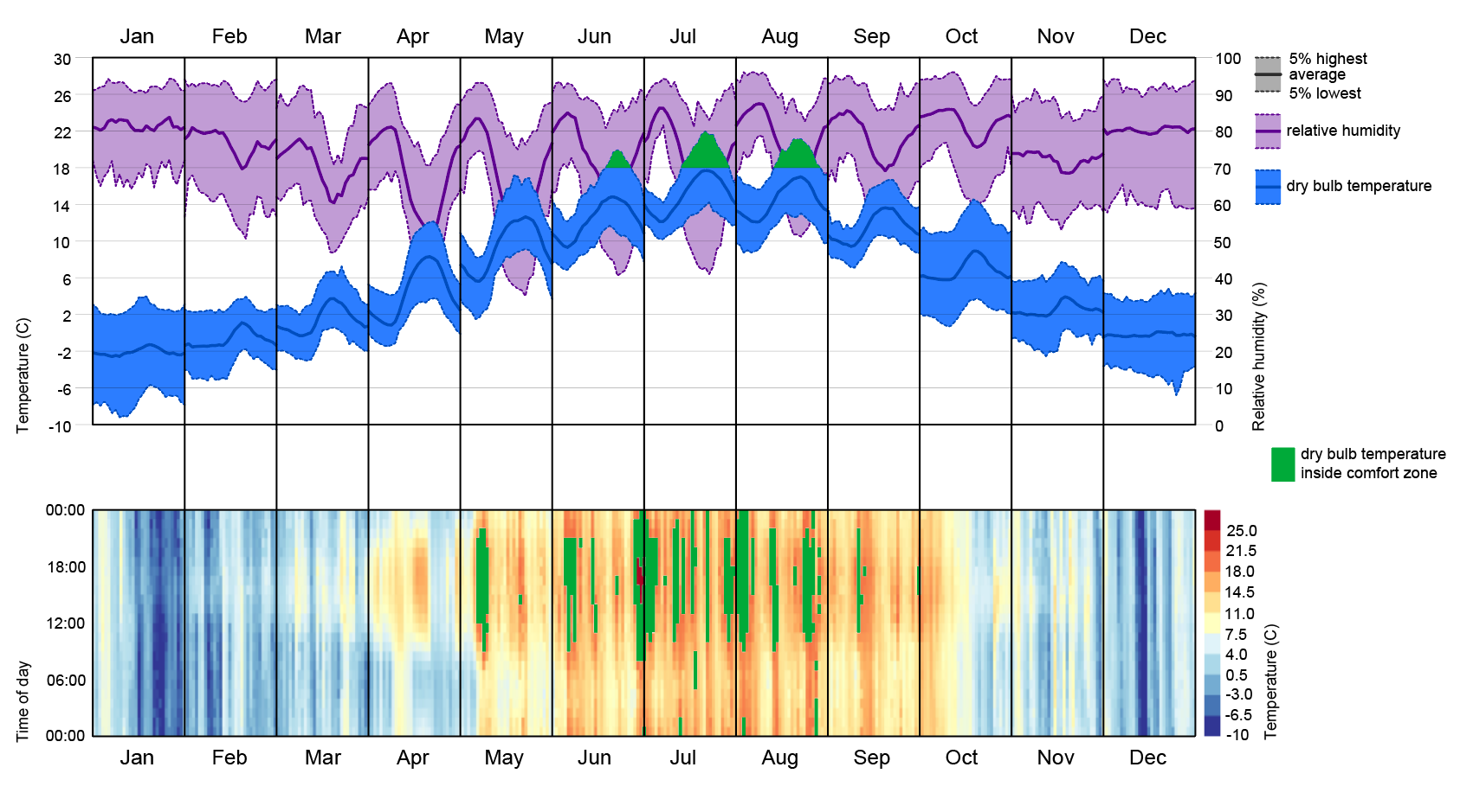
I ask this question because of the following discrepancy:
The hourly chart on the bottom is showing some hours within the comfort zone in the month of may (green areas) but the dry bulb temperature chart above does not show that the maximal values reach comfort zone in may. This is why I suggested that the “minimal/maximal” values do not show the actual maximal, but rather the average of the 5% minimal/maximal values.
And again, I’m not purely wondering about what the chart is showing, I’m also wondering how I can academically source the knowledge of what the chart is showing (I can’t just assume whatever)
Hope that makes sense!
The monthly chart at the top is not showing ALL 8760 values but average values of each hour of all days in the month. Probably this average in May is out of the comfort zone.
If you check the inputs you choose to create the plot you’ll find some hints/explanations about the data calculated for that plot.
BTW, September is also showing some green spots on the heatmap and not in the monthly plot.
Both outputs are not comparable because of this.
-A.
Thanks for the hint! By hovering over the inputs of the monthly chart I finally got an answer. The “percentile” input tooltip shows the following:
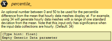
This input determines the top and bottom line of the chart. In the case of the default number “34” will essentially get rid of the bottom and top ~18% of values and draw the line at the remaining lowerst and highest values. I’m not a statistician so I don’t know about standard deviations but at least now I know how the lines are determined.