Following on from this question: Colibri limit for number of variables or length of variable names
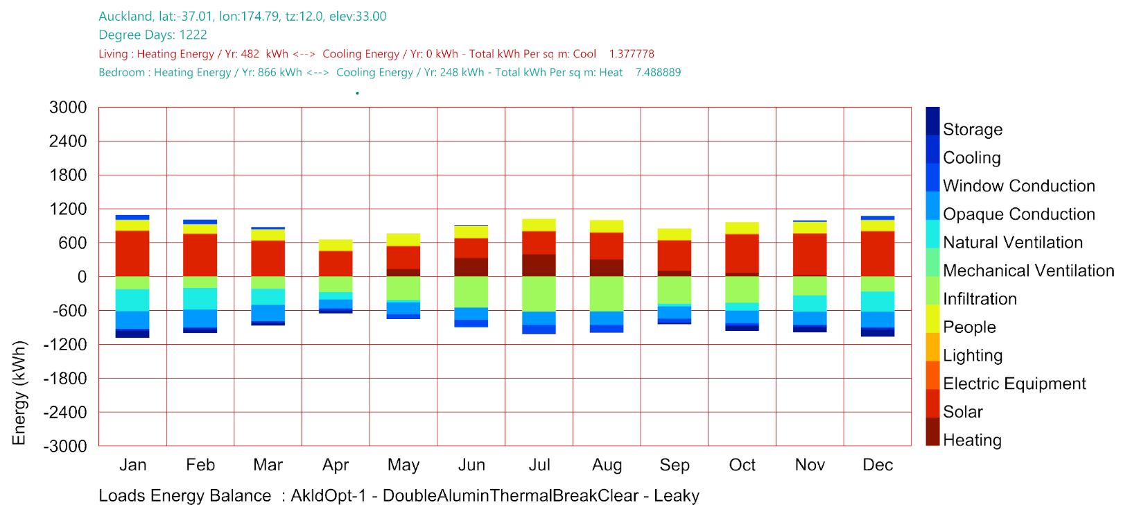
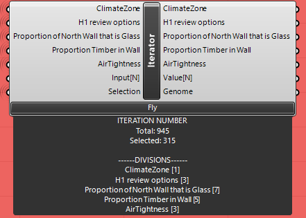
I have a Colibri based LBT script that runs 945 energy design variations (with 3 x energyplus calculations for each variation: Floating temperature, Energy Loads Balance, Monthly HVAC aware Energy Use) and produces outputs of: % time floating temperature is “Comfortable”, EUI, Heating kWh and Cooling kWh, plus 5 pictures for each of the variations.
The images are captured well into the same directory as the data.csv file.
Copying them all to GoogleDrive and making that data available to all with the link seems to work OK. But when I load the Google Drive into Design Explorer I get a blank page:
Ideas? I am going to try simplifying the file names for the graphics, but in the smaller trials these did not seem to be an issue.
I have faced the same problem , the issue was with the empty column in csv file.
Thanks. I will investigate
My first trials had a blank Image column because I had a blank line in the multiline text panel input. That worked! There is no blank column in my current process…
Thanks anyway
m
if you solve this, can you please post the solution.
Thanks
Hi Michael,
I have a similar issue with the images. They get correctly saved by Colibri, correctly named and reflected on the .csv file (they didn’t at the beginning either as I was not connecting that string) but they don’t load into Design Explorer even if the data does get plotted into the parallel coordinate graph.
Did you have any luck solving this in the end?
Thanks,
Ines
Hi folks
Just checking back into the forum after the summer vacation - no further news, I’m afraid. Will try again soon.
@TrevorFedyna had some good success using Streamlit and Plotly. Maybe we can deploy that as a Pollination app to replicate DesignExplorer. I’m not sure if Plotly’s parallel coordinates chart returns the selection. If it does then it shouldn’t be hard to create the app.
I’ve seen on the forumn somewhere that “you can finagle it to return the selection” apparently but its definitely pretty verbose and long winded compared to highplot for instance… but over-all feel like plotly>highplot in terms of “aesthetic” I’ll be basically wanting to do something like this for some work stuff; I’ll def share what I come up with in the near future; prolly class things up to make it cleaner than what I saw but can’t find at the moment in terms of returning selection.