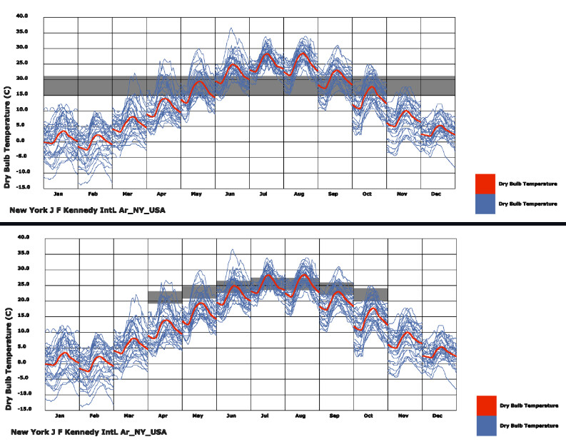
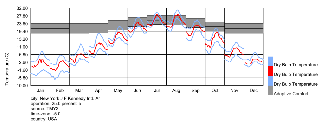
I’d like some help with creating a comfort band, ideally an adaptive comfort band similar to the second image expect it would extend to cover the entire year:
How would I go about plotting it? I would need the lowest comfortable winter temperature and the highest comfortable summer temperature if possible adapted to each month. Is there a ladybug component that works this out? Would I use the Adaptive Comfort component? If so, how? What’s the difference between the prevailing outdoor temp and desired neutral temp? Will the output be automatically shaded or will I need to construct a surface?
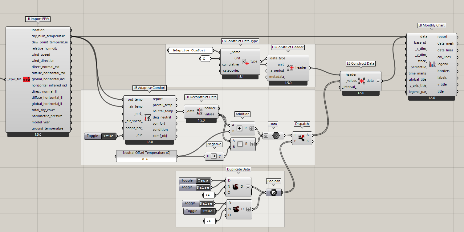
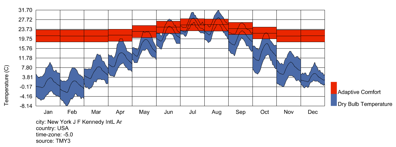
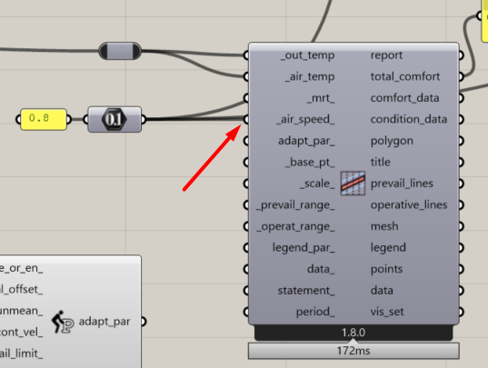
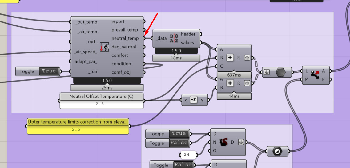
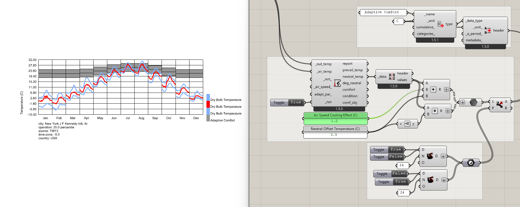
This is a good question, @Alapeace , though you’re actually the first person I know of to ask for this in the LBT plugin. I realize that the following is a lot more roundabout than Legacy but the best way to do this right now in the LBT plugin is to process the neutral_temp output of the LB Adaptive Comfort component into a data collection that gives you the range of adaptive comfort, which you can then plot on the Monthly Chart. Here is a sample:
If this is something that multiple people want, then maybe I can add a dedicated component for producing these data collections. But I feel pretty strongly that the Monthly Chart component should be very generic and there shouldn’t be an input for a specific data type on it like temperature.
If more people say that they need this, I’ll add a dedicated component or at least put together a sample that does everything with a single GHPython component instead of several native Grasshopper components.
It is been a while since i created this comfort band in Legacy. I’m for the addition of a dedicated or the sample, as you suggested @chris.
Thanks,
-A.
@chris Thank you for the sample! I appreciate it!
Since not many people have requested the adaptive comfort band, I’d say the sample is more than enough.
Thanks,
I am carrying out a similar exercise, but in my case I would like to account for the wind speed in the adaptive comfort model. In the adaptive chart is possible to input the wind speed but does not have a neutral temperature output.
However, in the adaptive comfort component, this input is not available but it does provide a neutral temperature output. I was wondering if this is happening for any specific reason?
In my case I have calculated the adjusted comfort temperature limit due to a air speed increase.
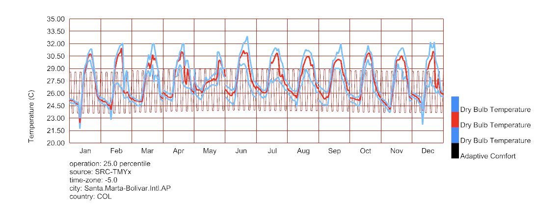
Hello, I tried to make the chart but I am quite new to this program, so I am still learning
This is what happened, I just can figure out how to get the comfort band in one solid color
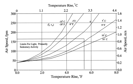
I know that I’m almost two years late here, @Julioamodia89 , but the air speed in the adaptive model only affects the number of degrees above from the neutral temperature that is considered comfortable. You can see that the official ASHRAE adaptive model uses a simple step function here:
So you just need to add that cooling effect to the upper boundary of the adaptive band like so:
It looks like you are close, @Madeleinekl . I recommend looking at the sample file since there is some sophisticated stuff with data trees going on with the input to the Monthly Chart component.