I know that Design Explorer is not under the Ladybug Tools team’s responsibilities. However, after searching for previous Design Explorer issues—and now experiencing similar problems myself—I’m struggling to reach any conclusion other than that DE is currently unreliable, at least in its present state.
Looking through the TTToolbox Discourse and the Design Explorer GitHub repository, I see multiple reported issues that have not received responses, and no visible development activity for several years.
Even examples that used to work, as examples previously shared on this forum, no longer function properly.
In my most recent attempt, nothing appears on the screen at all:
The maximum functionality I can get is opening the data.csv file locally. The graph appears, but the images do not.
This brings me to a broader question:
I’ve read about the possibility of developing an alternative user interface to Design Explorer. How realistic is this option at the moment?
From my experience, DE is (or at least was) very popular among LBT users—certainly among those I work with—so it would be helpful to understand the current outlook.
I know that sooner or later someone will ask this question : )
Last month, I updated the Design Explorer example of the pollination app and added some localization processing. This enabled users to preview their diverse cases locally before the cloud platform upload function was fully implemented. This had been shared within our Chinese community previously. You can obtain the locally ready application from this repository. We also provide a local Web Demo for testing some projects that are not convenient to set up locally.
I’m grateful this post gives me the opportunity to showcase it to a wider audience. Your testing is also welcome—the project’s web demo is hosted on a small server, accessible via this link.
What sets it apart from other design explorer projects is its support for .zip format uploads. It automatically extracts the data.csv file and image assets from the zip. While I haven’t recorded a new tutorial, it seamlessly integrates with the output from the Pollination Fly component. You can check out Mostapha’s demonstration on YouTube:
Thanks @ZhengrongTao !!
Really appreciate your initiative to bring this to be more up to date.
Going to your github i had some difficulties to install. From your response to @sarith i see there is an interface already working. I’m testing the local option from ZIP file. It is a bit slow, but I manage to load the graph. I have 2 images per option. The interface uploads only the first one. Is it possible to set more than one?
Thanks again for this very nice alternative to DE.
-A.
I
We’re glad you managed to run some cases successfully on our small server. However, its performance is limited, so I’d recommend setting up your environment locally instead.
My readme wasn’t clear enough.each release includes a click-to-run program packaged by our community users. You should be able to run it on your computer and follow the prompts to preview your local pages.This program is automatically packaged by the workflow provided by @QiH .
You’re right.my current solution doesn’t support previewing multiple images. but i should be able to address this within one or two updates. I expect to resolve this issue today or tomorrow. However, I’d appreciate a sample dataset. May I use the files you attached in your post as test cases?
I just pushed an update that lets you toggle between the previous or next image sequence using buttons, for previewing multiple sets of images. this update isn’t particularly elegant, and I still see a few minor issues. But I hope this solution will temporarily address the problem until I figure out a better way to display them.
Regarding the requirement to bold selected line segments, I’ve tried multiple approaches, but none successfully bolded the corresponding segments in the selected image. I’ll document this requirement for now and address it when I have sufficient time.
Very nice! This is great to see. I’m adding @mikkel here who developed the Dash version of the DesignExplorer. Maybe he can provide guidance on the remaining items on the list for highlighting the selection.
I also tried a few different approaches, and at the time it seemed not possible, and from the various issues on GitHub it also seemed like a known limitation that plenty of people have asked about in one way or another.
The Dash version of DE is here: https://design-explorer-316201d1c8e8.apps.production.pollination.solutions/. Just to clarify, the updated version presented in the previous comments is also Dash based. The idea with this app was to connect it with Pollination Cloud so you could select a folder or a ZIP file that you uploaded to Pollination, hence why this version doesn’t have any option for local files (yet). But since we shifted priorities including pausing cloud simulation, this project has been put on hold.
From what I can see, @ZhengrongTao’s update has the same functionalities, but you can use local files, so it is more useful at the moment. Nice work, Zhengrong!
Thanks @mikkel ,
Indeed nice work @ZhengrongTao !! Yesterday I tested it with my students and it went pretty well.
@ZhengrongTao a request for you though [hoping is an easy one]: Can the color of the unselected options be more light? I prefer them to not be shown, but if there are constraints for that, their grey is to strong making hard to differentiate the selected from the unselected.
Also, you can not get back to the default color set once you changed to a different one.
I don’t think your suggestions are difficult to implement, and we should be able to add them in the next update.However, this may not be added until next month.
I’ve summarized some suggestions and issues raised in this thread. While some problems seem straightforward, Python’s current frontend capabilities still appear relatively limited.
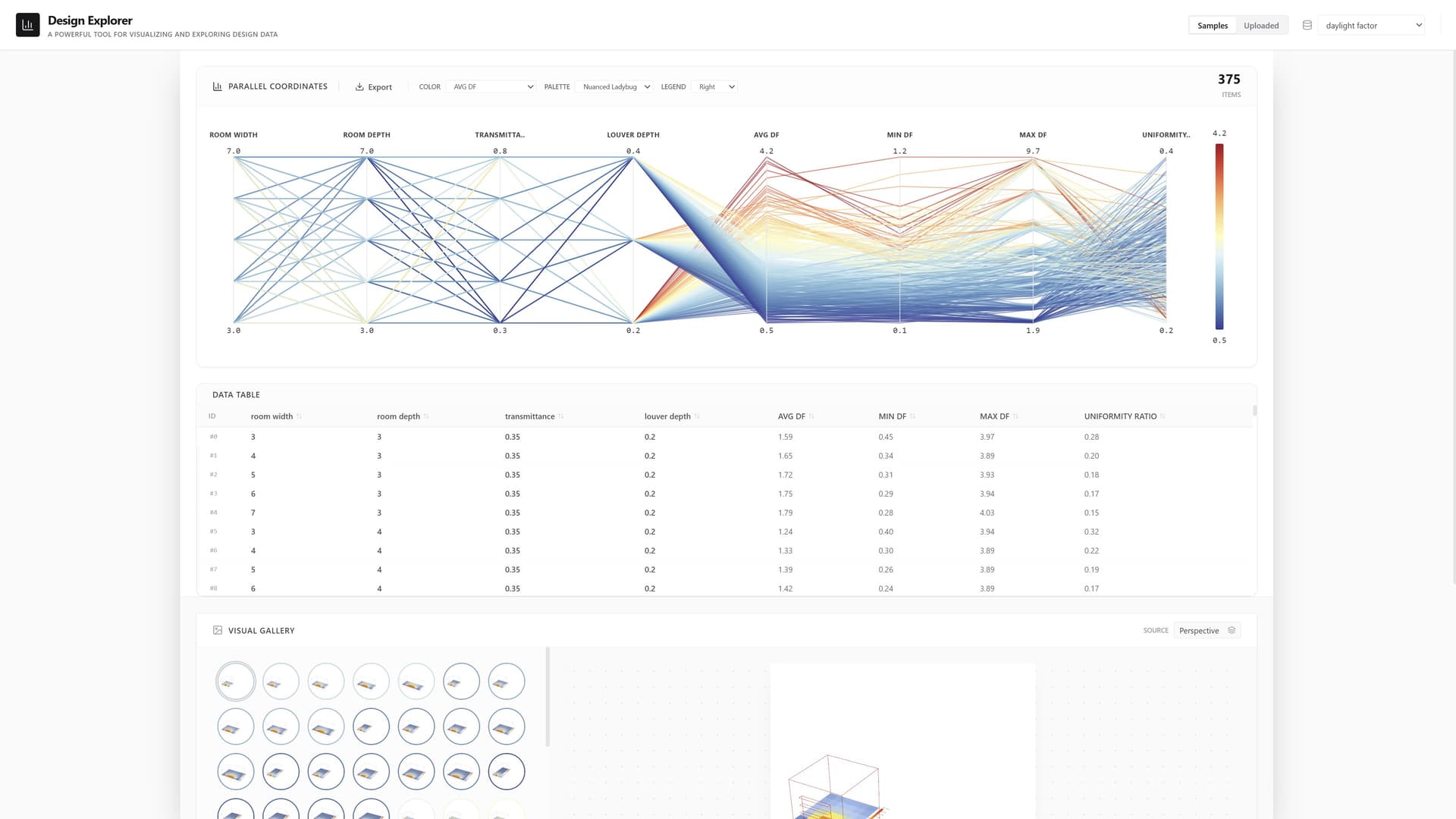
However, I spent a day building a new application using Vite+React technology. It might not be as fast as imagined, but it offers superior interactivity and extensibility.
I hope you can assist me in testing this project. As before, it retains the ability for fully local configuration and can also be launched via the launcher.
Hi @ZhengrongTao ,
Wow!!! This is excellent!!! What an improvement. I’d say it is almost perfect.
Love how you can switch on/off the selected option. Very nice.
Love how you allow to select ranges on columns [range don’t have to be continuous].
Love how you can reset the range selection.
Of course love that the selected option shows now in bold.
There are a couple of things I suggest:
When switching to Full Screen I couldn’t find how to get back to normal window. I closed the window and run again. Tried the shortcuts on the menu but there is no one to get back.
When selecting a range on some of the columns and pick one solution, the unselected ones [that are still in the range of selection] turn to grey, almost similar to the unselected. I suggest to leave the colors unchanged since the bold selection is solved now, or not making them so grey oriented.
Will be nice t have mid values in the columns. Right now you show only the top and bottom ones. I assume there is a technical reason for that, but if possible it will be nice.
Really appreciate your work @ZhengrongTao . Thanks!!
-A.
Hi again @ZhengrongTao ,
Too soon …
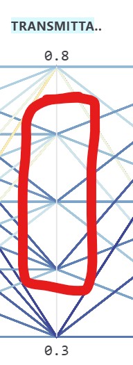
Now I tested a much bigger example [around 720 items].
It takes much longer to load and picking solutions may take some time.
Also, the graph doesn’t show correctly. For some reason the lines are constrained just to some part of the graph. I’m attaching the zip file so you can check by yourself [no images]. Can’t understand why this is happening.
I’m glad to hear your approval. I’m currently making some object-oriented modifications and fine-tuning adjustments to this project. I should be able to assist you with these suggestions shortly.
First, I need to confirm a few points with you.
I may need you to provide some additional screenshots or record potential videos to assist me with debugging. I believe this is an issue with the Electron interface, but on my end, resizing or adjusting the layout doesn’t seem to make any difference.
Regarding this, I actually learned from the HotPlot project. Currently, the data lines in the parallel plots have a relatively low transparency, which I can increase. However, I need to clarify that this change is quite conservative. I believe their relatively low transparency for comparison is an important part of achieving visual comparison. I will take more time to explore additional solutions and see if this can be made into an option for users to decide for themselves.
These are actually the two common sorting options in tables today: ascending and descending order. Currently, the interaction involves clicking three times to toggle between descending, ascending, and restoring the default sort order. I believe the default sort could be set to the middle value, which shouldn’t be too difficult to implement. What do you think?
I can see where the problem lies—it’s because your input variable in:Alt isn’t a number. This causes the table to be truncated starting from this variable when read. Perhaps I should write some logic to avoid this issue.
I meant when you switch to Full Screen [F11]. Then you can’t resize the window or return to the previous window size [I expected the escape key will do it, but no such option]. This is the screenshot: